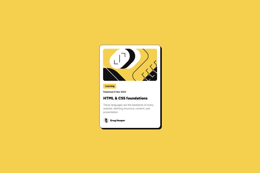
Design comparison
Solution retrospective
I'm quite proud of it, but I think I should write CSS more clearly next time.
What challenges did you encounter, and how did you overcome them?None, I'm just mostly worried whether how I wrote most of the stuff was good practice.
What specific areas of your project would you like help with?I just want to know what I should do differently, what stuff could've been done better.
Community feedback
- @clickgluePosted about 2 months ago
Hello, I think you've done an excellent job. I'm not an expert, but I can see your solution is well structured. Is it possible you forgot to implement the :hover for the main title? The challenge suggested that should change color on hover.
Marked as helpful1@JxPV5Posted about 2 months ago@clickglue Thanks for the kind words and pointing this out! I've just updated it with hovering and it was quite enjoyable.
0
Please log in to post a comment
Log in with GitHubJoin our Discord community
Join thousands of Frontend Mentor community members taking the challenges, sharing resources, helping each other, and chatting about all things front-end!
Join our Discord
