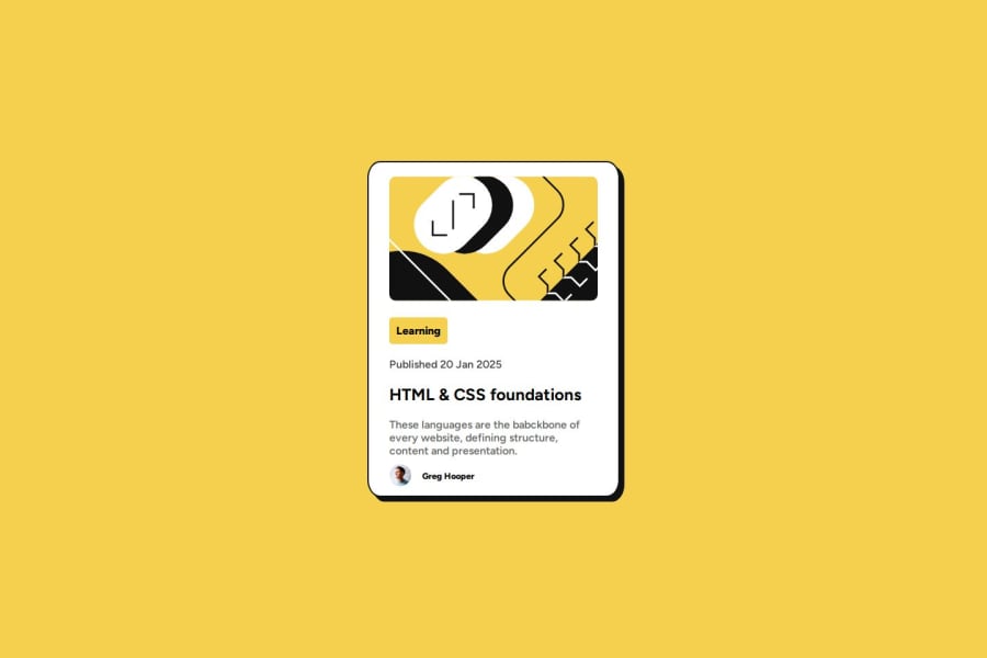


Design comparison

Solution retrospective
That I completed this project myself with minimal fuss. Going about trial and error trying to solve issue I saw until the solution looked as close to the challenge as I could get it to be.
What challenges did you encounter, and how did you overcome them?Centering the main card div was an issue again until I realized setting the height made things easier
What specific areas of your project would you like help with?Looking over the HTML and CSS to refine and clean up the code because I just added classes and styling to solve each problem I came across as they came. Although I might just be overthinking it and it might not be a cluttered piece of code.
Community feedback
- @skyv26Posted 2 months ago
Hi @teeogcode,
First of all, your work looks fantastic! 🙌 You're definitely on the right track. A few small suggestions:
-
Use
max-widthinstead ofwidth: Instead of setting a fixedwidth, consider usingmax-widthfor a more responsive design. This way, your elements can scale down if necessary, but won’t exceed a certain size. The beauty ofmax-widthis that it allows the element to adapt to different screen sizes, making it more flexible without needing the media query. 🎯With
max-width, you won’t need to use the media query at all. This simplifies your code and makes it cleaner and more efficient. 💻Here's how your updated code would look:
#main {
    max-width: 23em;
    margin: auto;
    background: hsl(0, 0%, 100%);
    display: flex;
    flex-direction: column;
    align-items: center;
    border: 2px solid hsl(0, 0%, 7%);
    border-radius: 5%;
    box-shadow: 7px 7px 0 hsl(0, 0%, 7%);
    transition: box-shadow 0.5s ease-in-out;
}
This way, you’ll have a more flexible design without worrying about breaking it on smaller screens. 🌱
-
Don’t overthink it!: You’re definitely on the right track by using classes! 💡 It's actually a great practice. If you were thinking about skipping classes or using IDs or tags directly, remember that frameworks like Bootstrap and Tailwind don’t rely on IDs or specific tag styles — they use utility classes to create modular and reusable components. This approach is widely recommended because it helps keep your code maintainable and scalable. 🚀
So, you're doing great with the classes! Keep it up, and don’t hesitate to experiment with more modern practices like this. ✨
Keep up the awesome work! You're doing an excellent job, and I can't wait to see how your project evolves. 👏
Marked as helpful0 -

Please log in to post a comment
Log in with GitHub
Join our Discord community
Join thousands of Frontend Mentor community members taking the challenges, sharing resources, helping each other, and chatting about all things front-end!
Join our Discord