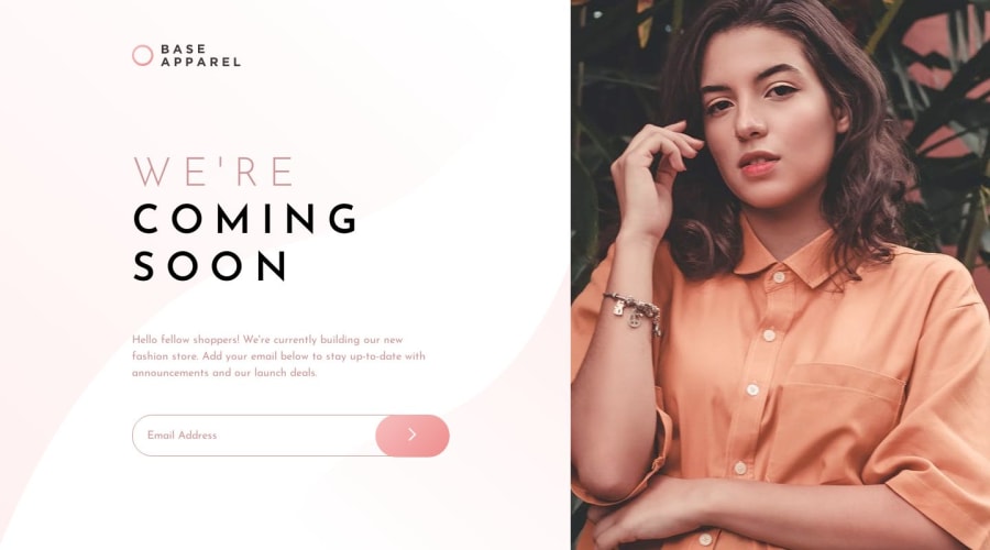
Responsive, BEM, input custom styling, Email validation, javascript
Design comparison
Community feedback
- @mattstuddertPosted over 4 years ago
Hey Deepak, great work on this solution. As you can see from the design comparison there are only small details like
line-heightand spacings that could do with refining.I'd also recommend reviewing the responsiveness of your project. Your only media query is set to
min-width: 376px;at the moment. This means anyone using a377pxscreen size up to a large tablet has to scroll horizontally to see all of the content. Try to ensure that your content scales up fluidly as screen sizes change to make the viewing experience great for all device sizes. It's a key part of a front-end developer's job, so it's well worth practicing and getting right 🙂You've done a really good job on this challenge. Keep up the great work!
2@kjdeepakPosted over 4 years ago@mattstuddert Thank you matt for your constructive feedback will work upon that and update the same!
0
Please log in to post a comment
Log in with GitHubJoin our Discord community
Join thousands of Frontend Mentor community members taking the challenges, sharing resources, helping each other, and chatting about all things front-end!
Join our Discord
