Responsive bar chart component with JSON data fetching
Design comparison
Solution retrospective
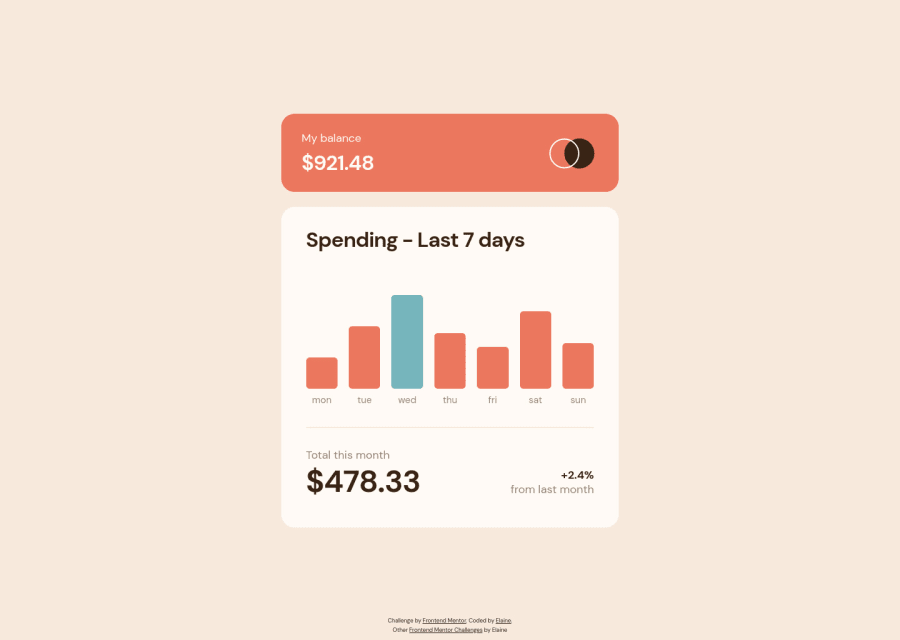
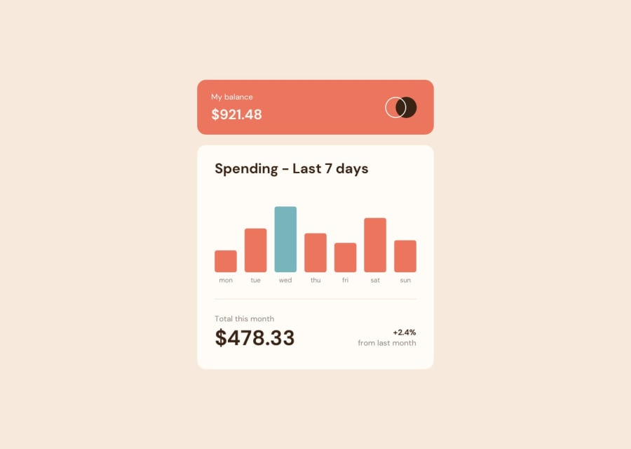
Just updated my solution as I realized that I had mistaken the highlighted bar to be the day with the largest amount, when in fact it should be the current day (as in, in real life). I also made the component responsive even at smaller sizes instead of just having two fixed widths; this normally is not so hard to do since content tend to be filling up the container, but in this content here is smaller than the container. To make sure the container doesn't collapse, I used the responsiveness of flex-wrap to ensure it would be at the size I need.
Community feedback
- @Amaefula-JoelPosted over 2 years ago
I'm really interested in knowing how you make your solution match almost identically to the design. What app do use? If it isn't an app, how do you make the perfect comparison
1@elaineleungPosted over 2 years ago@Amaefula-Joel Thank you for the comment! I don't use anything special, no tools and no libraries, just my eyes. I would line up my browser on top of the image and then compare how much more or less I'd need to adjust; usually I'd check the elements vertically first and then horizontally. I also make sure to only use
rem; I used to have a mix of things depending on what the property is, but now I find it's so much easier to just have the same unit.1@Amaefula-JoelPosted over 2 years ago@elaineleung I hope I can my train my eyes to do this. I'll try to do more of this in future challenges
0 - @DonUggioniPosted over 2 years ago
Hello Elaine,
I have a question about your code, as I'm currently working on this solution, I need some help =D
${info.amount * 0.1595}em=> how did you arrive at this value? The one you are multiplying the info amount by.Curious about how you got there!
Thank you =)
1@elaineleungPosted over 2 years ago@DonUggioni Hi Renan, sorry I just saw this! What I did was, I just lined up the bottom axes of the design image and of the div with my bar graph after I had the bars showing, and then just compare the top of the bars to see how much more I need to change to get my bar matching the design. Since I was using
emI just stuck with it, but you can use any unit of course.1@DonUggioniPosted over 2 years ago@elaineleung Hi there,
Thanks for the reply =)
I will give that a try and see how it goes =D
0@DonUggioniPosted over 2 years ago@elaineleung Hey there, finally finished the chart, if you want to, please have a look and let me know what you think =D
0
Please log in to post a comment
Log in with GitHubJoin our Discord community
Join thousands of Frontend Mentor community members taking the challenges, sharing resources, helping each other, and chatting about all things front-end!
Join our Discord
