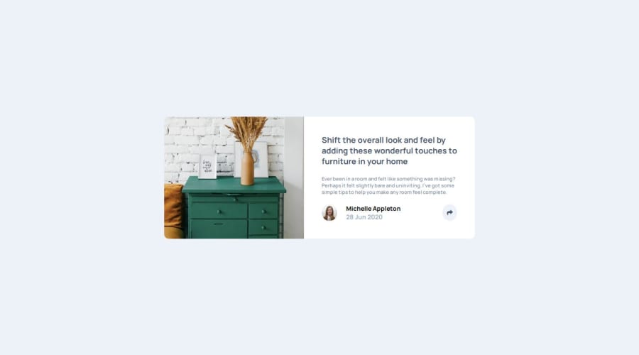


Design comparison

Solution retrospective
I'm proud because I managed to do the project all by myself. Next time I will watch everything that can help me finding issues and solutions.
What challenges did you encounter, and how did you overcome them?The size of the picture changed from the smaller sizes to the big one and it took a while to see the the figure tag needed to be resized. I use the console to see it. Then I had a little trouble to close the box with the link and I overcame it refreshing the browser.
What specific areas of your project would you like help with?It was easy, I don't think I would need help.
Community feedback
- @gauravk2203Posted 2 months ago
Suggestions for Improvement:
Use CSS Variables for Colors and Spacing:
Define CSS variables for colors, font sizes, and spacing at the root level. This avoids repetition and makes the design easier to update.
:root {
    --background-color: hsl(210, 46%, 95%);
    --text-color-primary: hsl(217, 19%, 35%);
    --text-color-secondary: hsl(214, 17%, 51%);
    --card-radius: 10px;
    --spacing-small: 10px;
    --spacing-medium: 20px;
}
Then use them:
body {
    background-color: var(--background-color);
}
Avoid Deep Nesting:
Deeply nested selectors like .card .card-body h1 can be harder to maintain and may lead to specificity issues. Try to keep selectors simpler and use class names to target elements.
.card-title {
    font-size: 16px;
    color: var(--text-color-primary);
}
Improve Responsiveness:
Consider using relative units
(like em, rem, %, or vw)instead of fixed units(like px)for margins, paddings, and font sizes to make the layout more fluid.Optimize Repeated Values:
If the same property-value pairs
(e.g., padding or border-radius)are repeated, move them to a shared class or parent container.Avoid Fixed Heights:
You mentioned fixed height for the container is an issue. Replace fixed heights with min-height or let the height adjust dynamically. Use
fit-contentfor Dynamic Layouts:For the #share section, consider width: fit-content for dynamic sizing instead of hardcoding widths.
Add Comments for Clarity:
While your code is structured, adding comments for specific sections can clarify the intent, especially for larger projects.
Group Media Queries:
Instead of repeating the same media query for different selectors, group them together for easier maintenance.
@media screen and (min-width: 768px) {
    .container {
        max-width: 600px;
    }
    .card-title {
        font-size: 18px;
    }
}
Example Refactor: Here’s how the body and container styles might look with these improvements:
:root {
    --background-color: hsl(210, 46%, 95%);
    --text-color-primary: hsl(217, 19%, 35%);
    --text-color-secondary: hsl(214, 17%, 51%);
    --card-radius: 10px;
    --spacing-small: 10px;
    --spacing-medium: 20px;
    --max-width: 320px;
}

body {
    background-color: var(--background-color);
    font-family: 'Manrope', serif;
    margin: 0;
    padding: 0;
    box-sizing: border-box;
}

.container {
    max-width: var(--max-width);
    margin: 0 auto;
    padding: var(--spacing-medium) 0;
}

img {
    max-width: 100%;
    height: auto;
}
Final Notes: Your approach is solid, and with a few tweaks, it will be even more professional and maintainable. Using tools like Prettier for formatting or a CSS preprocessor like SCSS can also help streamline your development process.
Marked as helpful1@DanieleErcoli243Posted 2 months ago@gauravk2203 Thank you for all your suggestions. I'll try to apply them. I've never used root properties, even though I saw them during a course, but I'll work on it. I tried to install scss on plain projects, but it didn't work. I read about relative units and tried to use them, but I found them harder to use, maybe I'll try them again.
1

Please log in to post a comment
Log in with GitHub
Join our Discord community
Join thousands of Frontend Mentor community members taking the challenges, sharing resources, helping each other, and chatting about all things front-end!
Join our Discord