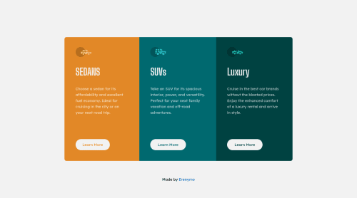
Not Found
Not Found
Not Found
Not Found
Not Found
Not Found
Not Found
Not Found
Not Found
Not Found
Not Found
Not Found
Not Found
Not Found
Not Found
Not Found
Not Found
Not Found
Not Found
Not Found

Submitted

Responsive 3 Column Preview Card

Eren 720

@erenymo

Desktop design screenshot for the 3-column preview card component coding challenge

This is a solution for...

  • HTML
  • CSS
1newbie
View challenge

Design comparison


SolutionDesign

Solution retrospective


Hi My friends !

I have completed this challenge using pure HTML5 and CSS3.

Any suggestion about Responsive is welcome :).

Community feedback

Vanza Setia 27,795

@vanzasetia

Posted

Hello, Eren! 👋

Replace all the <h1> with <h2>. There should not be more than one h1 on a page. Many <h1> elements mean many titles which can confuse the users, especially the screen reader users.

You should use CSS to uppercase the text instead of doing it manually—<h1>SEDANS</h1>. Screen readers might spell the uppercased word in the HTML (spelled letter by letter).

Use interactive elements for the "Learn more" buttons instead of using <div class="btn">Learn More</div>. Interactive elements can either be links or buttons.

For your information, anchor tags are for navigation. The <button> element is for an action like opening a modal, submitting a form, toggling an element, etc. It is essential to use the correct elements.

All the car icons are decorative images. I recommend leaving the alternative empty.

For your information, decorative images are images that don't add any information and serve only aesthetic purposes.

You should not wrap each element inside the card with <div> elements especially when they don't have any styling. I recommend removing them.

Add rel="noopener" to all links with target="_blank". It helps protect users of legacy browsers from security issues. Read more — Links to cross-origin destinations are unsafe

I hope you find this useful. Have fun coding! 😄

Marked as helpful

2

@salmafadlabdulrahman

Posted

Hello there, great job working on this project👏👏, I have a suggestion for you, in your project when you get to the the 375 width there is a side scrolling, which is somthing you need to avoid sometimes, to fix this make sure you don't have any element that has width more than the container which would cause side scrolling, also you could use this: (overflow-x : hidden), this css selector would make your side scolling disapper.

also there's a resource that helped me so much and I hope it helps you in matters of responsive web design, it's a course on scrimba.com called "Learn Responsive web design" I took the course myself and it helped me so much and I practiced on some good projects.

Marked as helpful

1

Please log in to post a comment

Log in with GitHub
Discord logo

Join our Discord community

Join thousands of Frontend Mentor community members taking the challenges, sharing resources, helping each other, and chatting about all things front-end!

Join our Discord