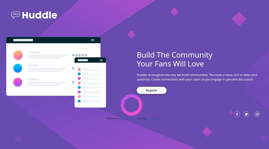
Responding landing page using bootstrap


Design comparison

Community feedback
- @skyv26Posted 3 months ago
Hello @Timilovic,
Great effort on your project! 👏 The design and structure are shaping up well, and I have a few suggestions to refine your implementation:
-
Background Image:
Your background image is repeating, which impacts the visual appeal. To fix this, use the following CSS properties:background-size: cover; background-repeat: no-repeat;This ensures your background spans the entire viewport without repeating.
-
Content Alignment:
The main content is not centered on the screen, which makes it look off-balance. Adjust your flex or grid properties to center-align the content. Aim to replicate the provided design as closely as possible for a professional finish. -
Styling Organization:
Consider moving your inline styles into a separate CSS file. Doing so will:- Enhance readability
- Simplify maintenance
- Ensure a cleaner HTML structure
💡 Example: Create astyles.cssfile and link it in the<head>section.
-
Semantic Structure:
A typical webpage is divided intoheader,main, andfootersections. Adding adivbetweenmainandfooterdisrupts this structure. You could either:- Integrate the additional
divcontent intofooter - Wrap it within the
mainif it’s part of the primary content
- Integrate the additional
-
Accessibility Enhancements:
- Add
alttext to images for screen readers. For example:<img src="images/logo.svg" alt="Huddle Logo"> - Use proper heading levels (
h1,h2, etc.) for better SEO and accessibility.
- Add
Bonus Tip ✨
Keep testing your design across various screen sizes and devices. Your use of media queries looks good, but refining the alignment and spacing on smaller screens will improve the user experience significantly.
Warm regards,
Aakash 🌟0 -

Please log in to post a comment
Log in with GitHub
Join our Discord community
Join thousands of Frontend Mentor community members taking the challenges, sharing resources, helping each other, and chatting about all things front-end!
Join our Discord