Design comparison
Solution retrospective
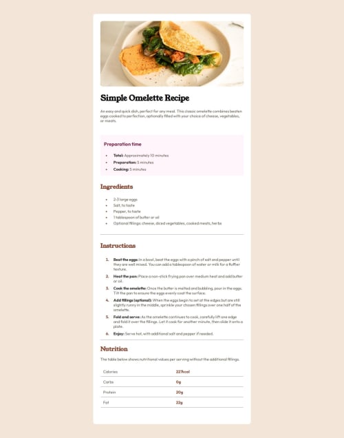
My main problem with this was the padding and margins of everything. There were times when things like a heading or a list wouldn't budge when I would add a number to the margin-bottom or padding-bottom property for example. Would like to know what that was all about.
Community feedback
- @beowulf1958Posted 27 days ago
Great job on completing this challenge. Everything looks great: typography, the colors, and the list markers. I like that you made the list markers bold; it makes them easier to see on the bulleted lists.
Just to piggy back on what @erntTt94 mentioned: the design breaks around 480px and at 375px width (iphone size) the table falls completely out of the container. The simple fix is to remove the height from the
.card
styles. This allows the container to take the height of the content automatically. Generally, having a fixed px height on an element interferes with the responsiveness.Hope this helps. And keep on coding.
Marked as helpful0@ks9927Posted 26 days ago@beowulf1958 just wanted to say thanks! Removing the height helped me make another challenge I did on here more responsive.
0 - @erntTt94Posted 27 days ago
Hey, good job! My suggestion is about the responsive design.. at 325px width the container is too small and your last table just goes out of the container.. so you can use @media and maybe you can added more height or you can change the font-size... :)
0
Please log in to post a comment
Log in with GitHubJoin our Discord community
Join thousands of Frontend Mentor community members taking the challenges, sharing resources, helping each other, and chatting about all things front-end!
Join our Discord