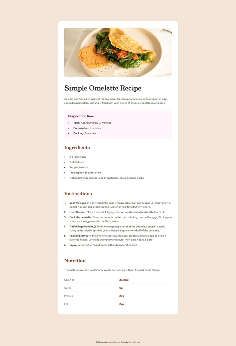
Design comparison
Solution retrospective
I made it quickly, but the lack of classes made my stylesheet a bit confusing, so next time I'm taking some more time to think about classes names.
What challenges did you encounter, and how did you overcome them?For some reason, the Young Serif font, even when set to rem is not adjusting with browser font-size, I don't know why and didn't find anything that explains it.
I would be grateful if someone could explain why the font-size is not working with Young Serif font, but any help is appreciated!
I think I used the semantic HTML tags correctly, but if not, please correct me! ^-^
Community feedback
- @geomydasPosted 3 months ago
The HTML seems good but you should use
<hr>elements as a replacemet for the .line divs. Replace the paragraphs in the table with the appropriate tags like tr, th, table. Don't see why you need an article in the table section, just use section instead0
Please log in to post a comment
Log in with GitHubJoin our Discord community
Join thousands of Frontend Mentor community members taking the challenges, sharing resources, helping each other, and chatting about all things front-end!
Join our Discord
