Submitted about 1 year ago
Recipe Page using TypeScript and LightningCSS
#vite#typescript

@clakr

Design comparison
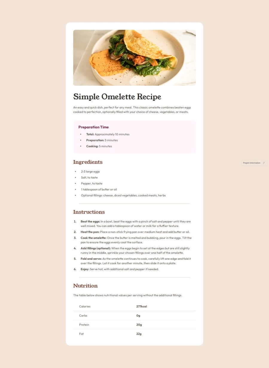
SolutionDesign

Solution retrospective
What are you most proud of, and what would you do differently next time?
I tried to be as pixel-perfect as it can be, but next time I would have use rem/em units instead of static unit such as px
I tried to have the "wrapper" element padding in each side but it will not work since the image for mobile breakpoint needs to be stretch side-to-side. Instead, what I did was to have each `` a padding-inline.
Community feedback
- P@emawidPosted about 2 months ago
- Good use of semantic elements
- Accessibility good be improved with aria-labels on sectionining elements
- layout looks good on mobilie and desktop according to specs
- solution very close to design
- alternative solution to mobile layout could be a "full-bleed" img element that bleeds outside of the wrapper. https://css-tricks.com/full-bleed/
0

Please log in to post a comment
Log in with GitHubJoin our Discord community
Join thousands of Frontend Mentor community members taking the challenges, sharing resources, helping each other, and chatting about all things front-end!
Join our Discord