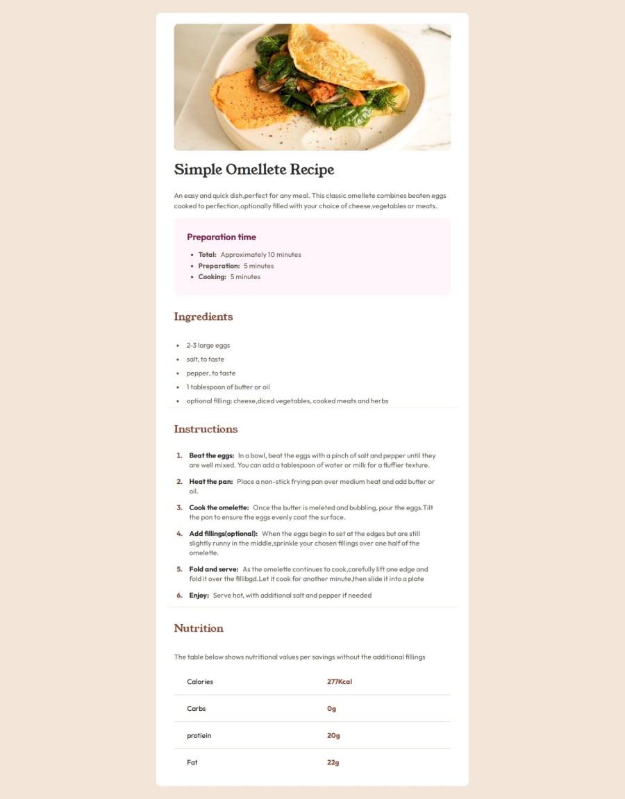


Design comparison

Solution retrospective
I'm proud to have taken up this challenge, and I know I will get better with more challenges.
What challenges did you encounter, and how did you overcome them?The table gave me a little bit of issue but i think i figured out my way around it
What specific areas of your project would you like help with?if there are easier ways to design the table, i would be open to suggestions
Community feedback
- P@toshirokubotaPosted 2 months ago
Hi, the solution looks good. The layout looks clean and aligned up nicely. One comment I want to give you is that if you continuously resize the window, then the size shifts abruptly at the breakpoints of your media query. That is caused by 'max-width: 50%' on main at the breakpoint of 768px. I think the responsiveness works better if you remove the style.
Happy coding!
Marked as helpful1

Please log in to post a comment
Log in with GitHubJoin our Discord community
Join thousands of Frontend Mentor community members taking the challenges, sharing resources, helping each other, and chatting about all things front-end!
Join our Discord