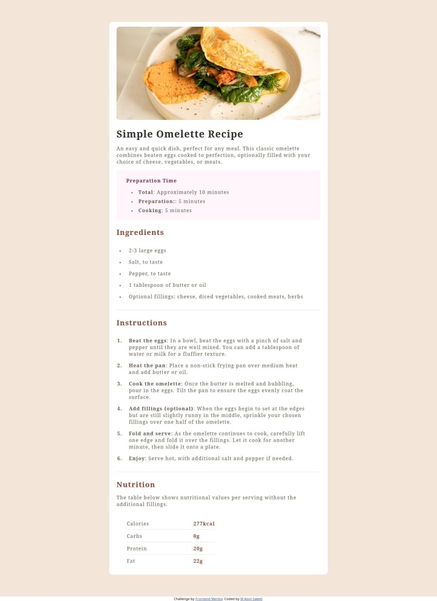
Design comparison
SolutionDesign
Solution retrospective
What are you most proud of, and what would you do differently next time?
I'm glad I have started using global variables, and utility classes and tried to achieve more with a smaller number of lines of code.
What challenges did you encounter, and how did you overcome them?I find styling list-style elements a bit tricky but I'm glad I managed to solve it using
What specific areas of your project would you like help with?li::marker{}
I'm trying to learn more about spacing across different devices.
Community feedback
- P@miedzygalaktycznygitPosted 6 months ago
Hello
- First of all You need to set min-values like "min-height:" and "min-width: ;" this will prevent Your website to escape of the screen when You swith to smaller device.
- For some basics in case of @media here is video that helped me in understanding this link_to_yt
- I hope that You find my advice helpful
Marked as helpful0
Please log in to post a comment
Log in with GitHubJoin our Discord community
Join thousands of Frontend Mentor community members taking the challenges, sharing resources, helping each other, and chatting about all things front-end!
Join our Discord
