Solution retrospective
I am proud for knowing most of what i was supposed to use in this challenge
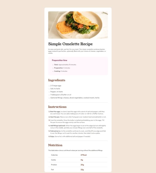
What challenges did you encounter, and how did you overcome them?I had a few challenges on this one, the first challenge was trying to style the markers on the lists, then how to style vertical lines and then how to make and style a table. As I was doing this challenge I was searching what I didnt know and trying to understand what i was confused about.
What specific areas of your project would you like help with?I feel like there's a lot of things i could've avoided or made differently but i honestly can't tell what is it. I searched a little about how I would do the spacing between the makers and the text on the list but I couldnt figure it out and i still haven't, also I wish I knew how to properly merge cells on the table or if i even was supposed to use a table on this challenge.
Please log in to post a comment
Log in with GitHubCommunity feedback
No feedback yet. Be the first to give feedback on Letícia Fernanda's solution.
Join our Discord community
Join thousands of Frontend Mentor community members taking the challenges, sharing resources, helping each other, and chatting about all things front-end!
Join our Discord