Design comparison
SolutionDesign
Solution retrospective
What challenges did you encounter, and how did you overcome them?
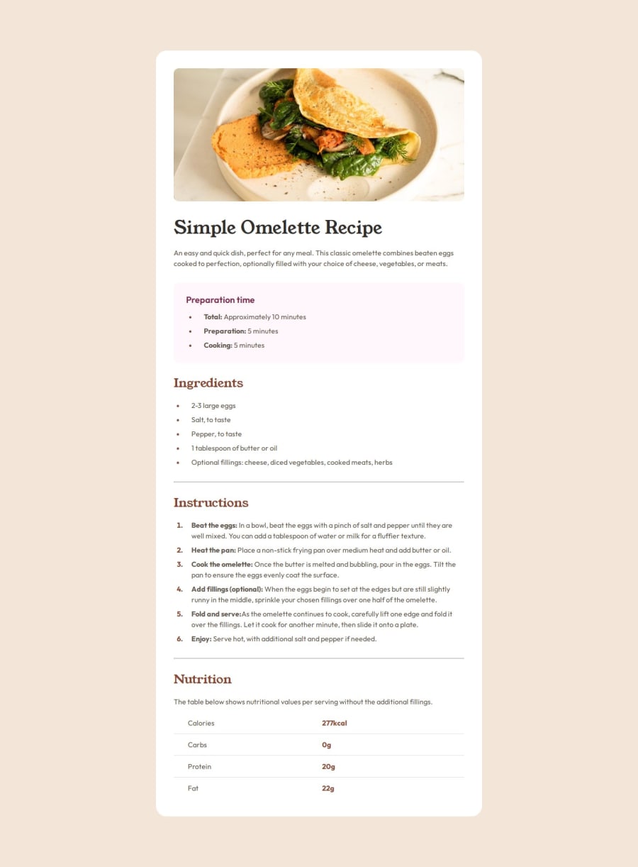
I did the bulk of this a month ago, and then got sidetracked. At the time all that was left to do was the spacing between sections, and inside the table. Also how to handle the header image using full width for mobile, and inside the card for desktop. (I think this was why I stopped at the time)
Community feedback
- P@tarasisPosted about 1 year ago
I'm aware of the H3 warning above. Will correct in due course.
0
Please log in to post a comment
Log in with GitHubJoin our Discord community
Join thousands of Frontend Mentor community members taking the challenges, sharing resources, helping each other, and chatting about all things front-end!
Join our Discord
