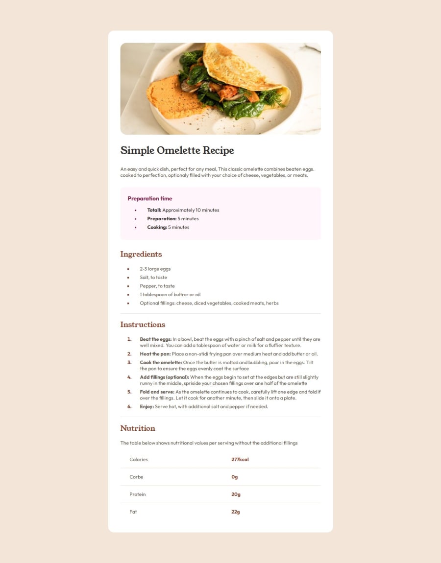
Design comparison
Community feedback
- @thetinyelephant85Posted 6 months ago
Great job! Considering I'm a beginner, I don't have much to add. Maybe my only feedback could be about the <h3>Preparation time</h3> tag that, based on the accessibility report I also received, it can become an h2 with the same style
Marked as helpful1 - P@StroudyPosted 6 months ago
Awesome job tackling this challenge! You’re doing amazing, and I wanted to share a couple of suggestions that might help refine your approach…
-
Your heading elements
<h1><h3>Missing<h2>, Heading elements should be in sequentially-descending order (e.g.,<h1>,<h2>,<h3>) to create a clear content structure, improving accessibility and SEO. Skipping levels or using them out of order can confuse screen readers, affect search engine rankings, and make your content harder to understand. -
Using
font-display: swapin your@font-facerule improves performance by showing fallback text until the custom font loads, preventing a blank screen (flash of invisible text). The downside is a brief flash when the font switches, but it’s usually better than waiting for text to appear. -
I think you can benefit from using a naming convention like BEM (Block, Element, Modifier) is beneficial because it makes your CSS more organized, readable, and easier to maintain. BEM helps you clearly understand the purpose of each class, avoid naming conflicts, and create reusable components, leading to a more scalable codebase. For more details BEM,
I hope you found this advice helpful! Keep up the great work, and don’t forget to dive deeper into the details. You’re doing amazing, and I can’t wait to see what you create next. Happy coding! 🚀
Marked as helpful1 -
Please log in to post a comment
Log in with GitHubJoin our Discord community
Join thousands of Frontend Mentor community members taking the challenges, sharing resources, helping each other, and chatting about all things front-end!
Join our Discord
