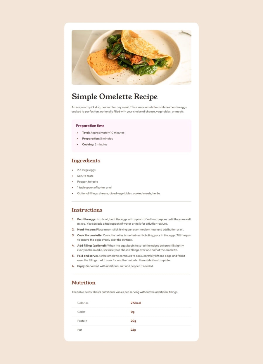
Design comparison
SolutionDesign
Community feedback
- @CrtykwodPosted 3 months ago
Hiii! You made a great job completing this challenge, and I hope you can make useful observations in your project!
-
The
asidetag is not correct in this context. It must be used to define content that is indirectly related to the main content. Preparation time is directly related to the recipe. -
font-sizeshould always be inremto garant accessibility. People who need to use bigger font-sizes will see no difference in you website because the font size used is fixed to a unique value.
0 -
Please log in to post a comment
Log in with GitHubJoin our Discord community
Join thousands of Frontend Mentor community members taking the challenges, sharing resources, helping each other, and chatting about all things front-end!
Join our Discord
