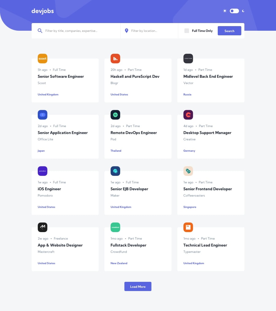
Design comparison
SolutionDesign
Solution retrospective
Still working out some bugs but the ideas are all there.
Community feedback
- @ApplePieGiraffePosted about 4 years ago
Hey, Daniel Beccaria! 👋
Good effort on this challenge! 👍
I suggest,
- Styling the job cards (or looking into why their styles aren't showing up if they already have some).
- I think you can fit another column or two of job cards into the space you have in the desktop layout. Doing so would be nice and leave less empty space to the sides of the page.
- Adding a hover state to the "Search" button.
Keep coding (and happy coding, too)! 😁
0@timegatedPosted about 4 years ago@ApplePieGiraffe Appreciate the feedback. I probably tried a few too many things for this project i.e. rolling my own webpack config, context for state management, and diving deeper into styled components at the same time. Overall it was a good lesson in deceptive simplicity and learning to manage complexity.
1
Please log in to post a comment
Log in with GitHubJoin our Discord community
Join thousands of Frontend Mentor community members taking the challenges, sharing resources, helping each other, and chatting about all things front-end!
Join our Discord
