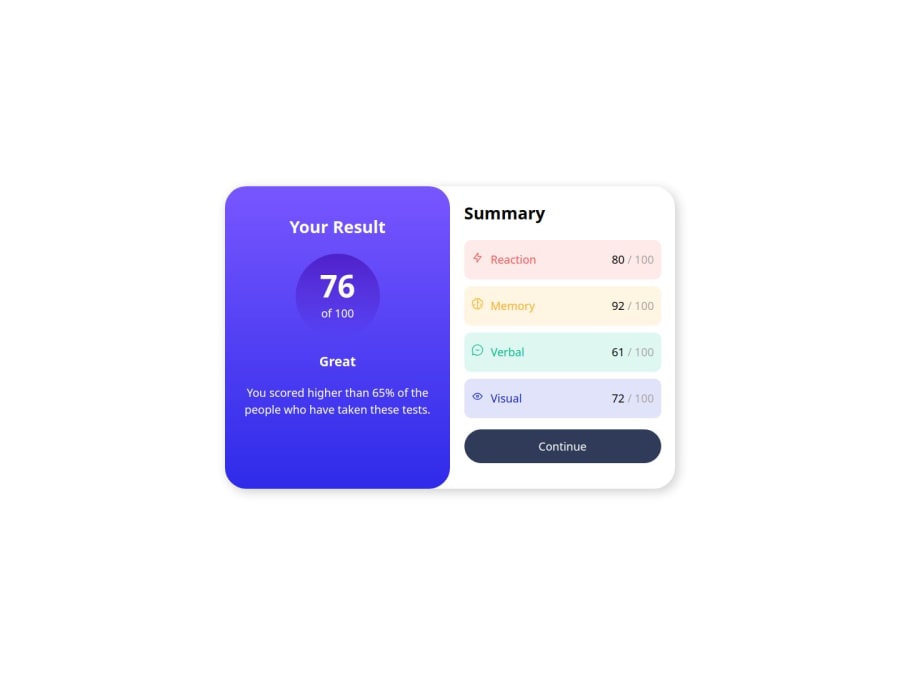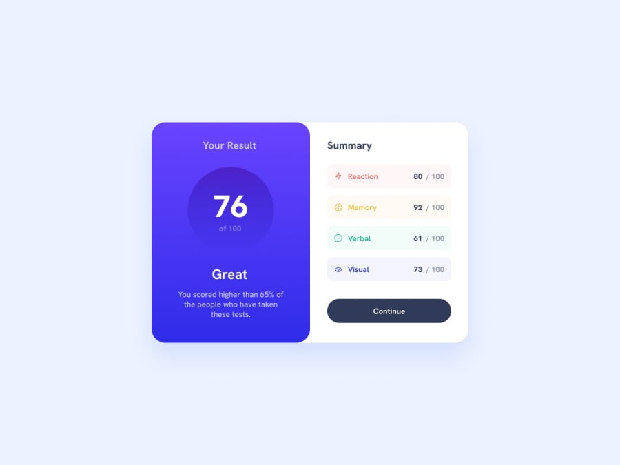
Design comparison
Community feedback
- P@YuliaLantzbergPosted 4 months ago
Hi. It's looking great and indeed perfect pixel. Only thing is, I felt it's extremely hard to read code with naming that is not related to the actual page. I mean, shopping cart, product_list, product_page. It really makes it hard to understand wich element on the page is related to the actual code and so it would be hard to maintain or for example to get new members of the team introduced to the code in the real world. In this particular case, if talking react, I'd rather break it into many small components related to the UI. Like ability_score, ability_name, total_score, button. And then to compose them into cards and lists and then to compose them into a page. I mean, like a general idea of course. I hope it makes sense. But from a user perspective, the result is looking really great.
0
Please log in to post a comment
Log in with GitHubJoin our Discord community
Join thousands of Frontend Mentor community members taking the challenges, sharing resources, helping each other, and chatting about all things front-end!
Join our Discord

