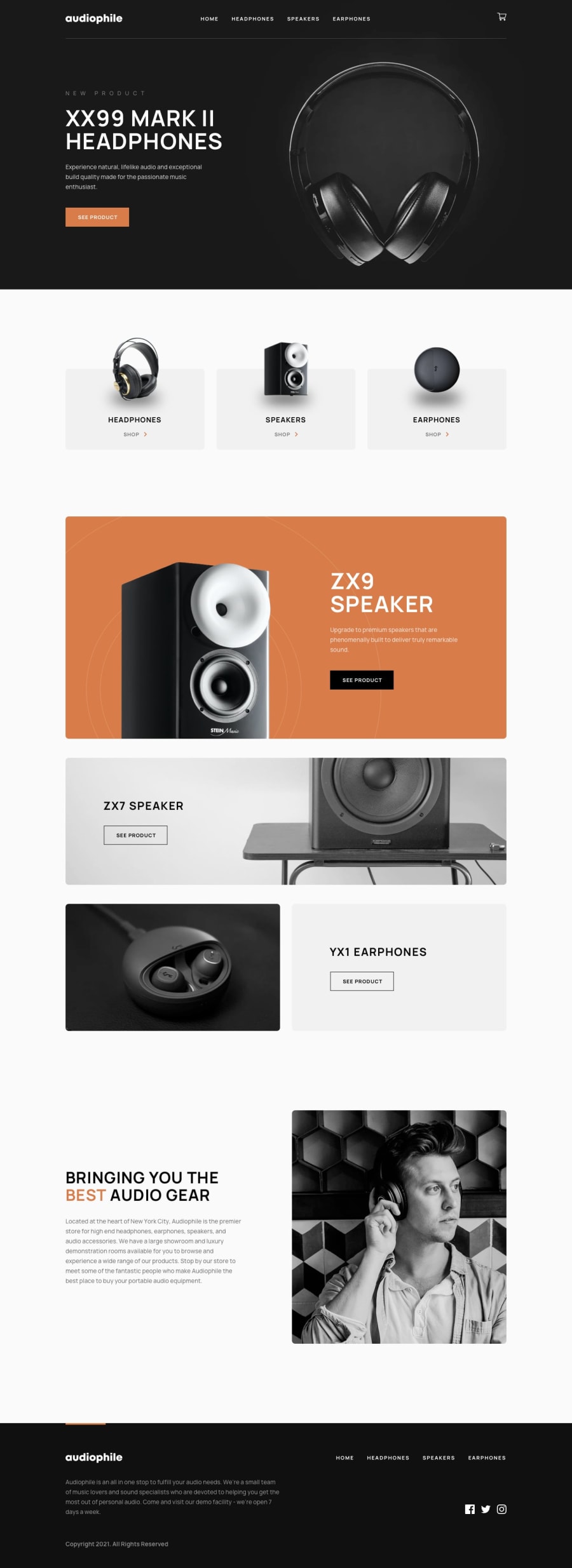
Design comparison
Solution retrospective
No specific questions.
I will deal with HTML validation issues later. I am open to all feedbacks & criticisms, thanks.
Community feedback
- P@tedikoPosted over 3 years ago
Hello, Jay! 👋
Congrats on finishing GURU challenge! 🎉 Forgive me for speaking so late, but I had a few days off. Your solution is flawless! I really like the animations you added. They look very smooth and the whole UI is great.
- I don't think you need
aria-labels in your header navigation links. It seems to me that they're self-descriptive. - It is different with the cart button tho. I'd add
aria-labelto button and keep my imagealttext empty. Also change this text to something more descriptive - 'cart icon image' doesn't speak much.
Good luck with that, have fun coding! 💪
Marked as helpful2@JunjiequanPosted over 3 years ago@tediko
Thx, Tediko.
I appreciate you point out the aria-label issues, I literrally abused aria-label attributes 😂. It reminds me that I suppose to add aria-control & aria-haspopup for modal as well to improve accessibility.
0 - I don't think you need
- @Kakasi-DanielPosted over 3 years ago
Nice!
0
Please log in to post a comment
Log in with GitHubJoin our Discord community
Join thousands of Frontend Mentor community members taking the challenges, sharing resources, helping each other, and chatting about all things front-end!
Join our Discord
