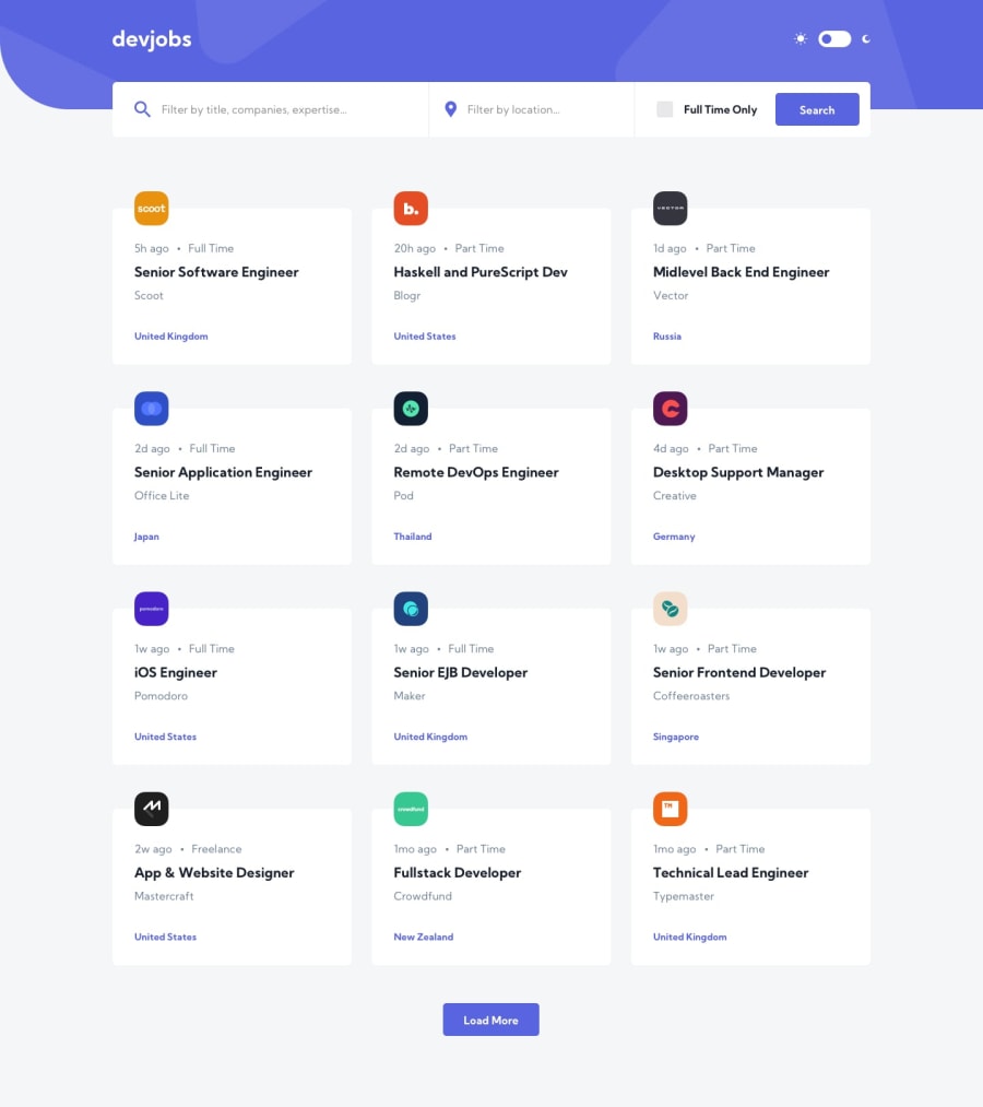
Submitted almost 3 years ago
React / Styled Components / Atomic Design / GraphQL / Tests / MSW
@MieszkoKowalik
Design comparison
SolutionDesign
Solution retrospective
- Some of the contrast ratios didn't meet accessibility requirements so I tweaked them to meet at least AA (Acceptable compliance) level.
- Instead of
Load Morebutton, I have incorporated pagination. - Main views in this app are lazy-loaded. This is a great way to minimize initial loading time for your app, in exchange for additional loading, when the user goes to a different view. In case of this project, it benefits in 0.2s shorter loading time in lighthouse mobile benchmark. The bigger the app, the bigger the impact.
- I have used a Headless CMS as a database for the job offers content. This allowed me to practice working with GraphQL API. Data is fetched using Apollo-client.
- During development I have used Mock Service Worker in combination with fakerjs library to create mock database and API. This way I avoided countless requests to my real API(which has limits). This is also a good technique if the API that you want to use is not yet ready.
Community feedback
Please log in to post a comment
Log in with GitHubJoin our Discord community
Join thousands of Frontend Mentor community members taking the challenges, sharing resources, helping each other, and chatting about all things front-end!
Join our Discord
