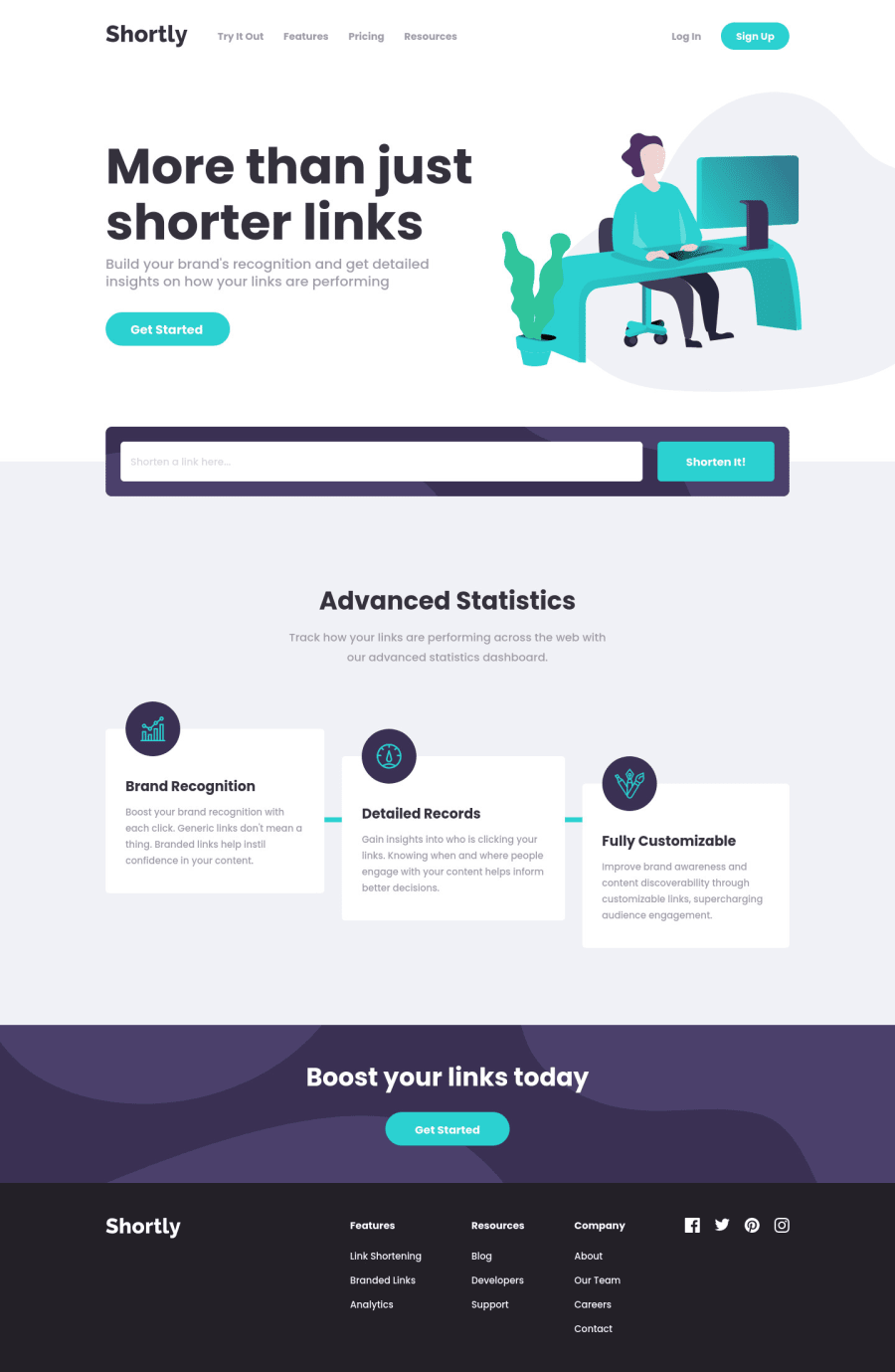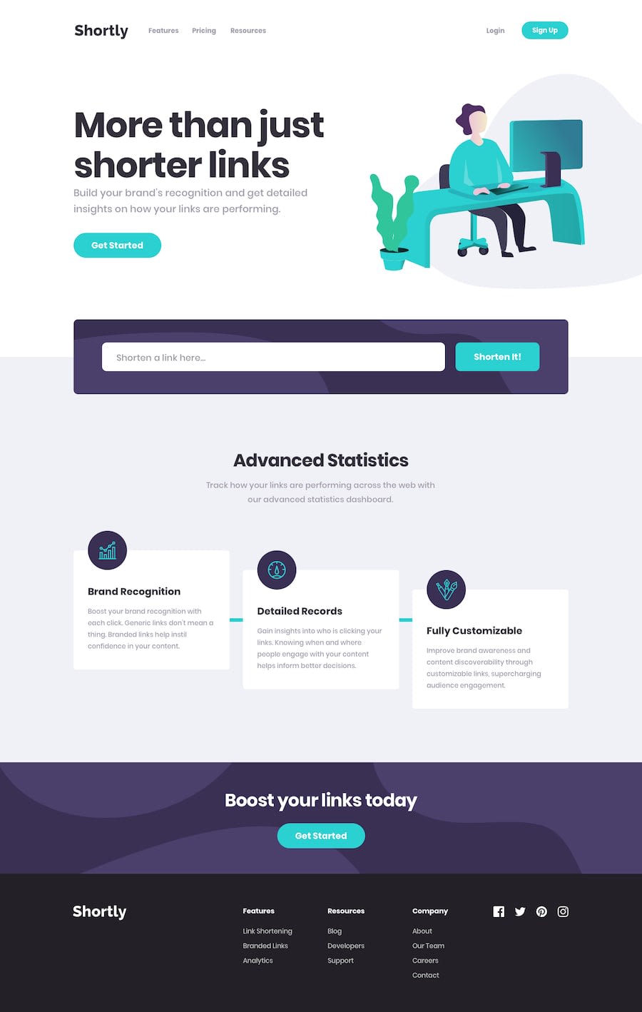
Design comparison
Solution retrospective
This is my first independent React project so I would love some feedback on organisation, components etc.
I added a delete button to shortened links as all of them are saved to local storage, as well as a Try it out link in the header that takes you to the form.
Please play around with link shortening and let me know if you spot any visual or functional issues. Thanks! :)
ps. Oh hello 100 html issues...
Community feedback
- @tedikoPosted almost 4 years ago
Hello, Agata! 👋
Congrats on finishing another challenge! I've not much to say, everything looks nice and responds well. I like you thought about keyboard users with focus elements. Can't wait to try React myself, but I need to be more comfortable with JS firstly 😅. A little suggestion from me since your logo image is decorative your logo image
alttext should be provided empty (alt="") so that they can be ignored by assistive technologies, such as screen readers. Also I don't think you need two navs, one for mobile and one for desktop. You can style it with media queries. Unless you prefer it that way, thats ok ;)Good luck with that, have fun coding! 💪
2@AgataLiberskaPosted almost 4 years ago@tediko So far React has been a lot of fun, but it focuses on dynamic apps so I'm not sure what to do when it comes to static parts of the site.
You're absolutely right about the logo, I totally missed that, thank you! And when it comes to nav I guess I do like it separate, I think it's simpler with JS and everything but I might give it a go in the next project just to try a different approach out!
0 - @jomefavouritePosted almost 4 years ago
Nicely done, Agata!
0@AgataLiberskaPosted almost 4 years ago@jomefavourite Thank you, it means a lot! :)
0
Please log in to post a comment
Log in with GitHubJoin our Discord community
Join thousands of Frontend Mentor community members taking the challenges, sharing resources, helping each other, and chatting about all things front-end!
Join our Discord
