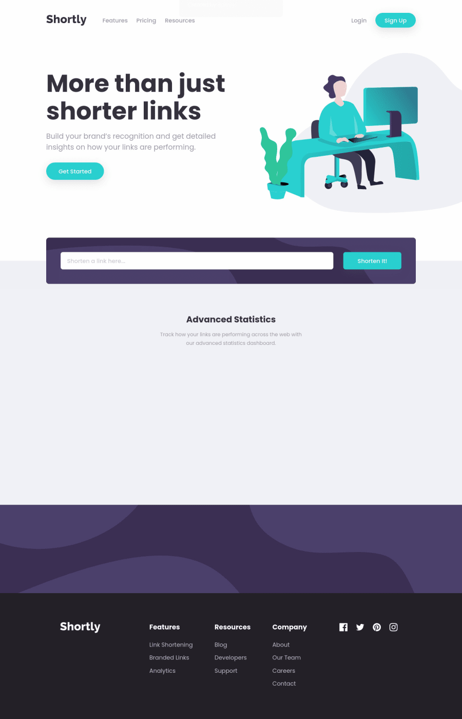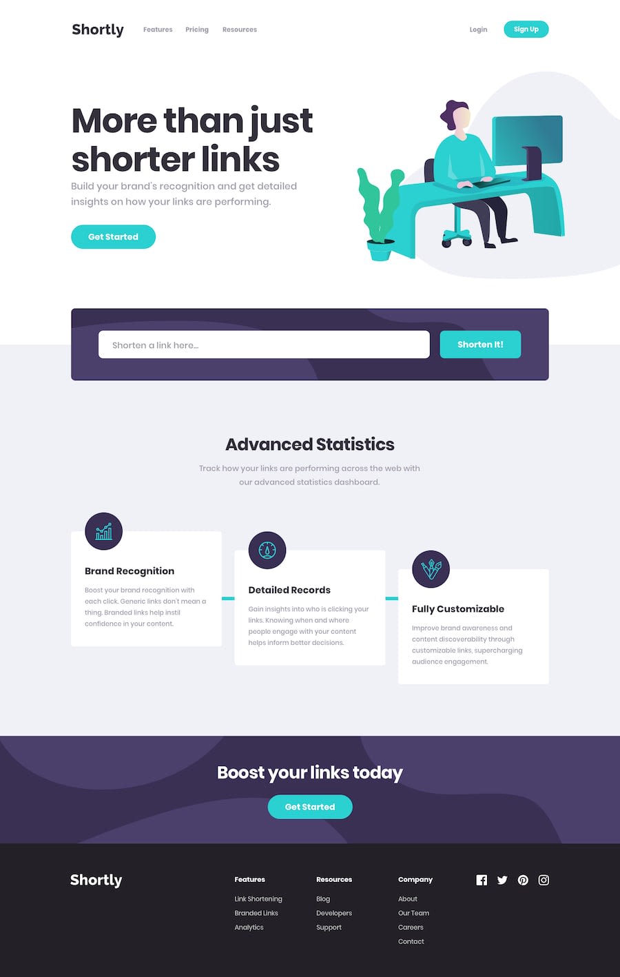
Design comparison
Solution retrospective
Hello, everyone! It's been a while since I put out my last solution. Nevertheless, I think this challenge was worth the time I put into it. 😉
- First of all, I learned about the URL shortening process and how to work with an API for that.
- Secondly, I deepened my understanding of the Framer Motion library. In particular, I finally got the hang of the
AnimatePresencecomponent that allows you to create animations for elements that are being removed. - Also, I decided to try something new and discovered a cool (yet very limited) library for animations on scroll: React Reveal. Going through its examples and picking the animations I needed was very enjoyable. 😄 There's one drawback, though: the animations aren't customizable, and some of them may show up too early or too late while you scroll. Anyway, all of it is just details.
Okay, let me know what you think about this challenge and perhaps my work on the whole. I'd greatly appreciate any feedback! 😊
P.S. The popup window that you see when you load the page for the first time appears only once. (You can clear your browser's local storage if you want to see it again.)
Community feedback
- @tedikoPosted almost 4 years ago
Hello, Bonrey! 👋
Good job on this one! Like ApplePieGiraffe well said the animations and popup are on point, it's nice touch. In my opinion this popup modal should pop up after user interact with input. So after clicking/focusing input it shoots. I believe that this is important information and often when something pops up right after entering the website, is to be turned off without reading. Additionally:
- Add
:focuspseudo class to interactive elements like anchors, buttons etc. Useoutlineproperty to make your website more accessible to keyboard users. Focusable elements like anchor, buttons or inputs they have applied default:focuspseudo class withoutlineproperty. These default styles are subtle and hardly visible tho. Furthermore every browser has a slightly different default style for the outline, so you probably want to change the default style. Read more about why we should change focus styles.
Good luck with that, have fun coding! 💪
1@BonreyPosted almost 4 years agoThank you, @tediko! You made a very good point about the popup. Actually, I just didn't know when and where to show it, so I just went with the easiest option. 😁
As for the accessibility concerns, I did want to add the outlines for anchors and buttons, but in the end, completely forgot about it. Thank you for pointing that out to me!
0 - Add
- @ApplePieGiraffePosted almost 4 years ago
Hi, Bonrey! 👋
It's nice to see you complete another challenge, as well (I just came here after seeing your comment on my solution)! 👍 I think you've done a great job on this one! 😀 The design of the popup that shows up on page load fits well with the rest of the site and the animations that you added throughout the page are a nice extra touch! 🙌
I hope you enjoyed working with Framer Motion for creating the animations in this challenge and it's good to hear that you learned other new things while working on this project! 😄
And—keep coding (and happy coding, too)! 😁
1@BonreyPosted almost 4 years ago@ApplePieGiraffe, thank you! I did learn quite a few things while working on this project. 😉
And happy coding to you, too! 😸
0
Please log in to post a comment
Log in with GitHubJoin our Discord community
Join thousands of Frontend Mentor community members taking the challenges, sharing resources, helping each other, and chatting about all things front-end!
Join our Discord
