Design comparison
Solution retrospective
Hello, everyone!
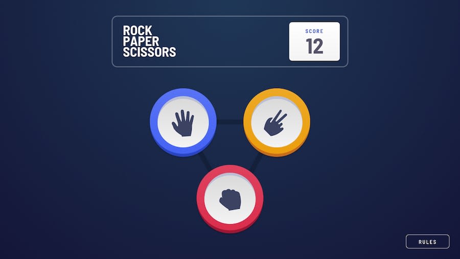
This time, I decided to create something new: a simple game. Making it was fun, and I learned lots of stuff along the way, as always. Especially about the Framer Motion library! It turned out to be very useful.
Anyway, I still have a couple of questions for the community:
- Is there a way to get rid of flickering images? I bet they are constantly preloading every time I refresh the site. And the whole experience isn't user-friendly at all. 😔
- Should I avoid using nested styles in
styled-components? And instead, try to create a separate Component for each element?
P.S. As regards the site functionality, I also added keyboard support:
- "1", "2", "3": "Paper", "Scissors", "Rock" respectively;
- "R": Show/Hide the rules popup;
- "Esc": Hide the rules popup;
- "Space"/"Enter": Play Again;
- "Y": reset the score (else it is saved in your local storage);
As always, I would highly appreciate any feedback! 😃
Community feedback
- @RayaneBengaouiPosted over 3 years ago
Hello Bonrey,
Really nice to see you completing another challenge ! 🙂
I think that you should avoid as much as possible nesting with Styled Components. While coding it might be quicker and simpler, but if the application scale or you decide to re-use components then you'll be happy to simply import them instead of copy pasting 😃.
Otherwise, your project is super clean ! Really like how smooth you've made your animations and all the little details such as the keyboard accessibility, the reset button or even the growing circles around the winner !
Have a nice day and happy coding ! 😃
1@BonreyPosted over 3 years ago@RayaneBengaoui thanks a lot for your constructive comment! 🙂
From now on, I'll try to avoid nesting as much as possible!
0
Please log in to post a comment
Log in with GitHubJoin our Discord community
Join thousands of Frontend Mentor community members taking the challenges, sharing resources, helping each other, and chatting about all things front-end!
Join our Discord
