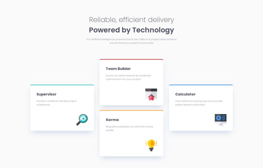
Design comparison
Solution retrospective
I spend less time practicing than others, but I really feel that I am making progress now.
I hope to become a web developer someday!
What challenges did you encounter, and how did you overcome them?This is my first attempt at using grid layout. I prefer to use Flexbox for my website layout because I find grid to be more complex. However, in this practice, using Flexbox made it difficult to complete the layout as I wanted. I was pleasantly surprised to discover that grid can achieve this layout so simply. I'm really happy to have gained another skill in layout design, allowing me to tackle different layout challenges.
What specific areas of your project would you like help with?Same question!
I still feel afraid of making mistakes since I don't have a computer science background, so please feel free to point out any mistakes in my practice!
Community feedback
- P@mariosearchteamPosted 4 months ago
Hey! :)
Great solution, the only thing that comes to my eye is the border. It took me a while to figure out, how to make the edges straight as in the design. I used a pseudo element instead of the top-border like this:
&__card::before { content: ""; position: absolute; top: 0; left: 0; width: 100%; height: 3.5px; background-color: var(--clr-accent, var(--primary-red)); border-radius: var(--spacer-sm) var(--spacer-sm) 0 0; }
1
Please log in to post a comment
Log in with GitHubJoin our Discord community
Join thousands of Frontend Mentor community members taking the challenges, sharing resources, helping each other, and chatting about all things front-end!
Join our Discord
