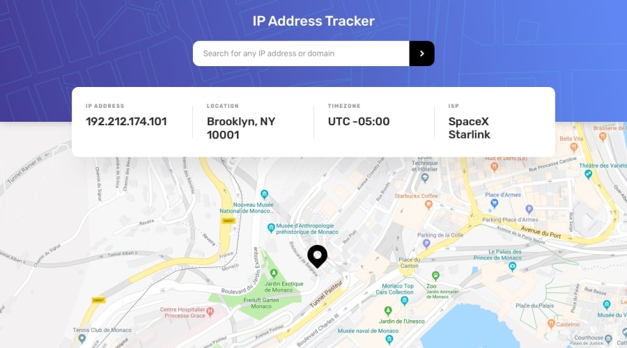
Design comparison
SolutionDesign
Solution retrospective
Feel free to leave any feedback.
Also when I change to the mobile version for some reason the button won't stay centered, if you know how to fix it I'd really appreciate your help.
Thank you, happy holidays =D
Community feedback
- @emestabilloPosted almost 4 years ago
Hi Bianca, great job! Tracker works well. The layout on medium screens though, around 480px to 1000px, needs a bit of refactoring.
.infooverflows andheading-primaryis getting cut off, and I'm not able to scroll up to view the rest of the text. I'm not sure about the button because I'm not getting the same issue on my end. Hope this helps! Happy holidays! :-)0
Please log in to post a comment
Log in with GitHubJoin our Discord community
Join thousands of Frontend Mentor community members taking the challenges, sharing resources, helping each other, and chatting about all things front-end!
Join our Discord
