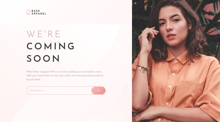
Design comparison
Solution retrospective
So I decided to use grid because I find myself using flexbox for everything. At desktop screen, I found that since logo and content area are separate grid area, I can't have the same background image spanning across the two grid areas. Any solution for that would be appreciated along with any other feedback.
Community feedback
- @skyv26Posted over 3 years ago
Well, Good work. Try to stick with requirements. You can easily find in Readme.md file, according to, it requires to add custom email validation support. But it is up to us so no issue here, but in workplace/company it matters alot.
0@AyushDevkotaPosted over 3 years ago@skyv26 Thank you for the feedback Aakash. I've updated so that I've used custom form validation.
0
Please log in to post a comment
Log in with GitHubJoin our Discord community
Join thousands of Frontend Mentor community members taking the challenges, sharing resources, helping each other, and chatting about all things front-end!
Join our Discord
