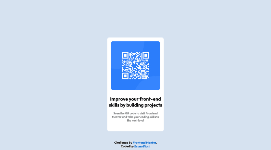
Design comparison
Community feedback
- @ecemgoPosted almost 2 years ago
Some recommendations regarding your code that could be of interest to you.
In order to make the card responsive and avoid repetition in your code, you can follow the steps below:
HTML
- You need to update the html structure in this way:
<body>
  <main>
    <div class="qr"><img src="images/image-qr-code.png" width="260" height="260"></div>
    <div class="text1"><br>Improve your front-end<br> skills by building projects</div>
    <div class="text2"><br>Scan the QR code to visit Frontend<br>Mentor and take your coding skills to<br>the next level</div>
  </main>

  <footer>
    Challenge by <a href="https://www.frontendmentor.io?ref=challenge" target="_blank">Frontend Mentor</a>. <br>
    Coded by <a href="https://github.com/BrunoSFiori">Bruno Fiori</a>.
  </footer>
</body>
CSS
- If you want to make the card centered both horizontally and vertically, you'd better add flexbox and
min-height: 100vhto thebody - You can define
font-familyhere to avoid repetition
body { font-family: "Outfit", sans-serif; background-color: hsl(212, 45%, 89%); display: flex; flex-direction: column; align-items: center; justify-content: center; min-height: 100vh; }- When you use flexbox in the
body, you don't need to usemarginin themainto center the card - If you use
max-width, the card will be responsive - You'd better give padding to give a gap between the content and the border of the card
- You can define
text-alignhere to avoid repetition
main { background: hsl(0, 0%, 100%); /* width: 300px; */ max-width: 300px; /* height: 500px; */ border-radius: 10px; /* margin-left: auto; */ /* margin-right: auto; */ /* vertical-align: middle; */ /* margin-top: 200px; */ /* position: relative; */ padding: 20px; text-align: center; }- In addition to that above, in order to make the card responsive and the image positioned completely on the card, you'd better add
width: 100%to the img
img { border-radius: 10px; width: 100%; }- You've already defined the class name for text so you don't need to define them as
div.text1. You'd better define them by the name - You can update texts and
footerin this way:
.text1 {
  /* font-family: "Outfit", sans-serif; */
  color: black;
  font-size: 25px;
  /* text-align: center; */
  /* position: relative; */
}
.text2 { /* font-family: "Outfit", sans-serif; */ color: gray; font-size: 15px; /* text-align: center; */ /* position: relative; */ }footer { /* font-family: "Outfit", sans-serif; */ /* position: absolute; */ position: fixed; bottom: 0; /* color: black; */ /* height: 50px; */ text-align: center; /* width: 99%; */ }Hope I am helpful. :)
0 - @0xabdulkhaliqPosted almost 2 years ago
Hello there 👋. Congratulations on successfully completing the challenge! 🎉
- I have other recommendations regarding your code that I believe will be of great interest to you.
CSS 🎨:
- Looks like the component has not been centered properly. So let me explain, How you can easily center the component without using
marginorpadding.
- We don't need to use
marginandpaddingto center the component both horizontally & vertically. Because usingmarginorpaddingwill not dynamical centers our component at all states
- To properly center the component in the page, you should use
FlexboxorGridlayout. You can read more about centering in CSS here 📚.
- For this demonstration we use css
Gridto center the component.
body { min-height: 100vh; display: grid; place-items: center; }- Now remove these styles, after removing you can able to see the changes
div.quad {
   margin-top: 200px;
   position: relative
}
- Now your component has been properly centered
.
I hope you find this helpful 😄 Above all, the solution you submitted is great !
Happy coding!
0 - @pperdanaPosted almost 2 years ago
Hello there 👋. Congratulations on successfully completing the challenge! 🎉
- I have some additional recommendations for your code that I think you'll find interesting and valuable.
📌 Add
<main>tag as semantic HTML in code-
The
<main>tag is a semantic HTML element that is used to define the main content of a web page. -
The
<main>tag should be used to wrap the primary content of a web page, such as the main article, section, or body of text.
for example code:
<main>
  <div class='container'>
    <h1>Article Title</h1>
    <p>Article content goes here...</p>
    .......................
  </div>
</main>
In the example above, the
<main>tag is used to wrap the<div>tag, which contains the primary content of the web page. This tells both human readers and search engines that the content inside the<main>tag is the most important and relevant content on the page.I hope you found this helpful!
Happy coding🤖
0 - @Cyber-ChicPosted almost 2 years ago
Your solution looks awesome! Great job completing this! 😊
I have a few small recommendations that may improve your site:
-
Add a <h1> element to your page. All sites should include a minimum of one <h1> element to indicate the the most important (or highest-level) heading on a page.
-
Add alt text to your QR code image. Alt text is used to describe images on a website. My recommended description for this is alt="QR code to frontendmentor.io"
I hope this is helpful! Happy Coding!
-Angie
0 -
Please log in to post a comment
Log in with GitHubJoin our Discord community
Join thousands of Frontend Mentor community members taking the challenges, sharing resources, helping each other, and chatting about all things front-end!
Join our Discord
