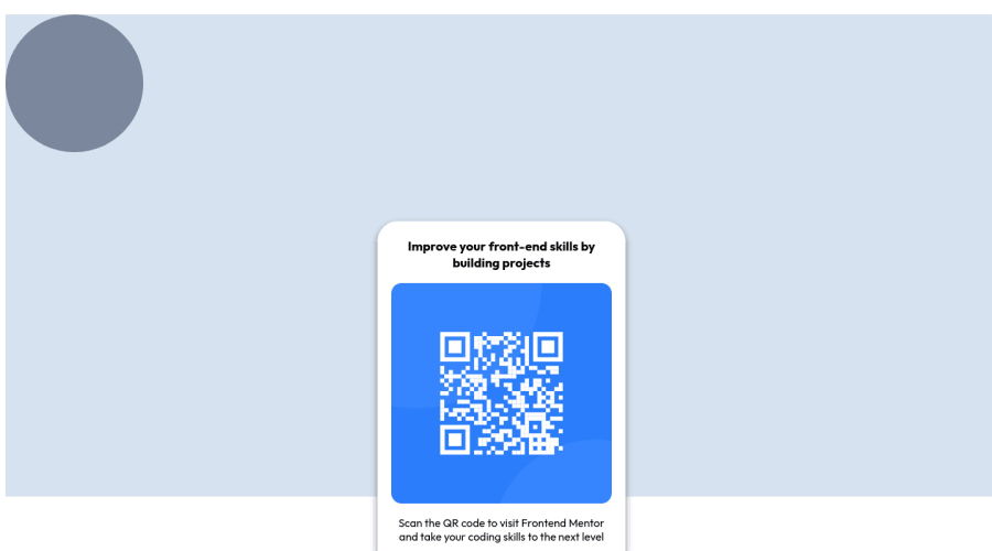
QR-code component solution using HTML, CSS keyframes and animations.
Design comparison
Solution retrospective
I would appreciate your feedback. I take every feedback into consideration on my projects because I appreciate the time you put into trying to help out. Thanks in advance.
Community feedback
- @lidiakrajewskaPosted over 2 years ago
Hi! It would be good if you wrap all your content in main tag, except for attribution that could be a footer. Also don't leave empty h1 tag, instead you could have " Improve your front-end skills by building projects" as your h1, because we use h1-h6 headings to imply hierarchy, not because of their font size (it should be adjusted with font-size property). A thing that one has to take into consideration these days is also how your page looks on mobile devices - if it's responsive. To check it use DevTools in your browser and click "Toggle device toolbar", you can choose what kind of device should your browser simulate. Happy coding and good luck!
1
Please log in to post a comment
Log in with GitHubJoin our Discord community
Join thousands of Frontend Mentor community members taking the challenges, sharing resources, helping each other, and chatting about all things front-end!
Join our Discord
