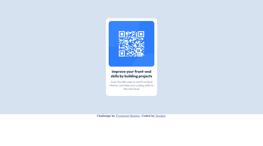
Design comparison
SolutionDesign
Community feedback
- @ecemgoPosted almost 2 years ago
Some recommendations regarding your code that could be of interest to you.
- If you want to make the card centered, you'd better add
align-items: center;andmin-height: 100vhto thebody
body { flex-direction: column; align-items: center; min-height: 100vh; }- If you use flexbox in the
body, you don't need to usemarginanddisplayin the.cardto center the card - If you use
max-widthinstead ofwidthandheight, it makes the card responsive - If you want to give the gap between the content and the border of the card, you can use
padding
.card { /* height: 100%; */ /* width: 250px; */ max-width: 250px; padding: 15px; /* display: in-block; */ /* justify-content: center; */ /* margin-top: 100px; */ /* margin-bottom: 100px; */ }- In addition to that above, in order to make the card responsive and the image positioned completely on the card, you'd better remove
height
.image { width: 100%; /* height: 50%; */ border-radius: 15px; }- After following above, the card will be responsive. Finally, you don't need to use media query for this solution
/*
@media screen and (max-width: 375px) {
}
*/
Hope I am helpful. :)
0 - If you want to make the card centered, you'd better add
- @Bader-IdrisPosted about 2 years ago
You can set the container in the middle of the screen whatever user changes it when you add these properties to it in CSS:
.container {
  position: absolute;
  top:50%;
  left: 50%;
  transform: translate(-50%, -50%);
}
the new feature is transform, it has many lovely properties you can discover, I personally love it. Hope it's useful
0
Please log in to post a comment
Log in with GitHubJoin our Discord community
Join thousands of Frontend Mentor community members taking the challenges, sharing resources, helping each other, and chatting about all things front-end!
Join our Discord
