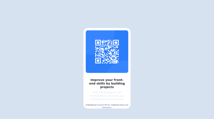
Design comparison
Solution retrospective
Hello and welcome to my attempt at the qr-code challenge. I used bootstrap cards to complete this challenge. I would greatly appreciate feedback on things I could improve! Thank you!
Community feedback
- @HassiaiPosted almost 2 years ago
To center .card on the page, add min-height:100vh; display: flex; align-items: center: justify-content: center; or min-height:100vh; display: grid place-items: center to the body.
To center .card on the page using flexbox:
body{
min-height: 100vh;
display: flex;
align-items: center;
justify-content: center;
}
To center .card on the page using grid: body{ min-height: 100vh; display: grid; place-items: center; }Give .card a padding value for all the sides and the img a max-width of 100%, there is no need to give .card a margin value.
Give h1 the same font-size as p.
Hope am helpful.
Well done for completing this challenge. HAPPY CODING
Marked as helpful0 - @astr0n0merPosted almost 2 years ago
Hey @n-uzumaki, you're off to a great start
HTML:
- You can replace the
<h5>with an<h1>for better accessibility - Do the styling in CSS
CSS:
- You can explore CSS naming conventions, namely BEM. This will make your code more readable for yourself and for others. Don't get me wrong, your code is readable even now, but BEM or any other convention for that matter, will definitely be helpful
Happy coding. Good luck 😁😀
Marked as helpful0@n-uzumakiPosted almost 2 years ago@astr0n0mer Thanks for your feedback! I just changed the heading level to h1, and I'll definitely check out the naming convention link. Thanks again!
0 - You can replace the
Please log in to post a comment
Log in with GitHubJoin our Discord community
Join thousands of Frontend Mentor community members taking the challenges, sharing resources, helping each other, and chatting about all things front-end!
Join our Discord
