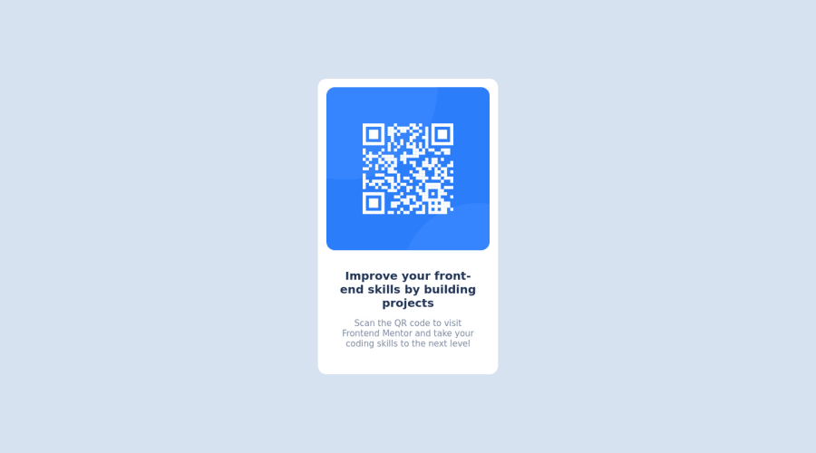
Design comparison
SolutionDesign
Community feedback
- @IryDevPosted over 1 year ago
Hi @SOU-Code 😄. Congratulation on successfully completing your first challenge on the platform ! !
I have some recommendations in order to improve your solution.
HTML :
- Replace the
<div class="main">by the semantic<main>tag. - Replace the
<div class="attribution>by the semantic<footer>tag - Semantic html improve accessibility of your web page
CSS :
- Replace the property
width: 20%of the container by the propertymax-width: 300px, cause on tablet screen your card has a width to small
I also make pull requests on your Github repo to add this property so you can merge it if the changes suit you
I hope you'll find this helpful! 😄 Above all, the solution your is really good!
0 - Replace the
Please log in to post a comment
Log in with GitHubJoin our Discord community
Join thousands of Frontend Mentor community members taking the challenges, sharing resources, helping each other, and chatting about all things front-end!
Join our Discord
