Design comparison
Community feedback
- @chinh1402Posted about 1 year ago
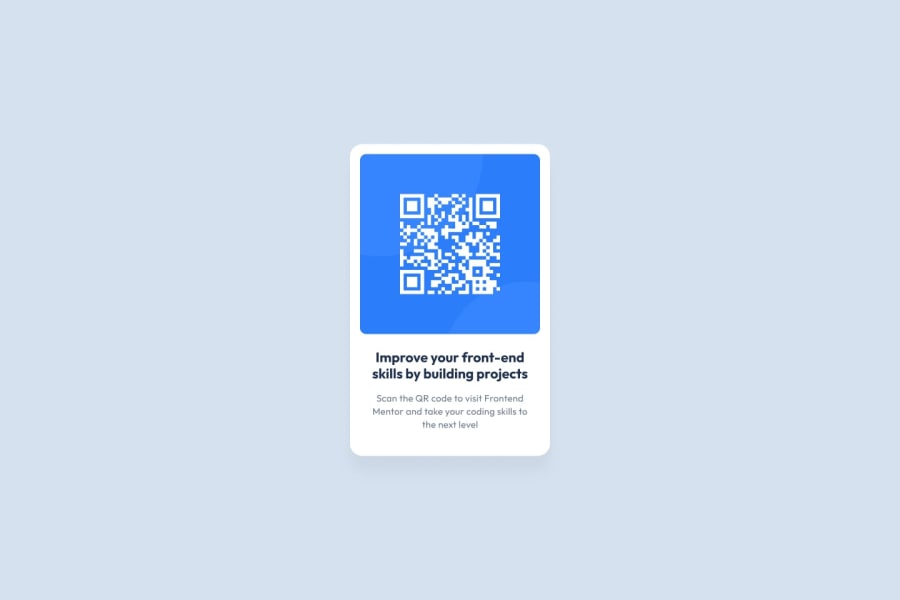
Hello there, congrat on finishing the challenge 🎉.Your solution looks good, and I have a suggestion to make it look better, which is:
Increasing the font-size of headline. Why? The goal of the headline is to be the second thing people look at (the first thing should be the qr-code) to find why they should use that qr-code. By increasing font-size, you are guiding the users to read the UI in a "ordered" way.
In term of codes, I think you should change a bit in the --spacer variable to make more room for headline text to be bigger (give them more room to work with)
Hope you find my suggestion useful!
Happy coding!! 😆
Marked as helpful0@nenadvg95Posted about 1 year ago@chinh1402 Apologies for late response - work and family , but i would really like to thank you for helpful advices. I will try to keep in mind . Cheers :)
1
Please log in to post a comment
Log in with GitHubJoin our Discord community
Join thousands of Frontend Mentor community members taking the challenges, sharing resources, helping each other, and chatting about all things front-end!
Join our Discord
