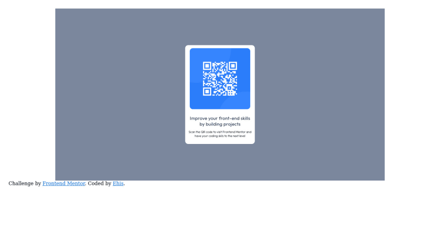
Design comparison
Solution retrospective
I need help on the mobile version .
Community feedback
- @ecemgoPosted about 2 years ago
Some recommendations regarding your code that could be of interest to you.
CSS
- If you want to center it correctly, you can use flexbox in the
body:
body { /* padding: 20px; */ /* max-width: 1440px; */ display: flex; flex-direction: column; justify-content: center; align-items: center; min-height: 100vh; background-color: hsl(212, 45%, 89%); // the recommended background-color }- secondly, you don't need
.bd-backgroundanymore, you can remove it - you also need to remove
margin-topandmargin-bottombecause of the flexbox which is used in thebody - also, you want to adjust the card depending on mobile size, you can use
max-width
.text-container { background-color: hsl(0, 0%, 100%); margin-left: auto; margin-right: auto; padding: 10px; /* width: 20%; */ /* height: 20%; */ /* margin-top: 100px; */ /* margin-bottom: 100px; */ border-radius: 10px; max-width: 220px; // max-width makes it responsive min-height: 275px; }- finally, if you want the
.attributionat the bottom
 .attribution {
    text-align: center;
    position: fixed;
    bottom: 0;
  }
Hope I am helpful. :)
Marked as helpful0@timberstreamPosted about 2 years agothanks. can you help with @media example for this challenge? @ecemgo
1@ecemgoPosted about 2 years ago@timberstream
This solution is already responsive through flexbox and
max-width. You don't need media queries in this project.In addition to the above, you can remove
.bd-backgroundbecause you don't need it:/* .bd-background { background-color: hsl(220, 15%, 55%); width: 75%; height: 80%; margin-left: auto; margin-right: auto; padding: 20px; min-width: 375px; } ` */Hope I am helpful. :)
0 - If you want to center it correctly, you can use flexbox in the
- @sumanth-chandanaPosted about 2 years ago
Hi mate! congrats on completing the challenge. I have suggestions from my side that may help you:
- Use
background-coloron the wholebody, not on thecontainer. - An
<img>must contain analtattribute by default so that screen readers might know the element present over there. - Use
@media queriesto resize the HTML elements in your page, for more on that click here
I hope my feedback will help you.
Marked as helpful0 - Use
- @EmilianoGomezAPosted about 2 years ago
Hello!, what problem do you have in the mobile version?
0
Please log in to post a comment
Log in with GitHubJoin our Discord community
Join thousands of Frontend Mentor community members taking the challenges, sharing resources, helping each other, and chatting about all things front-end!
Join our Discord
