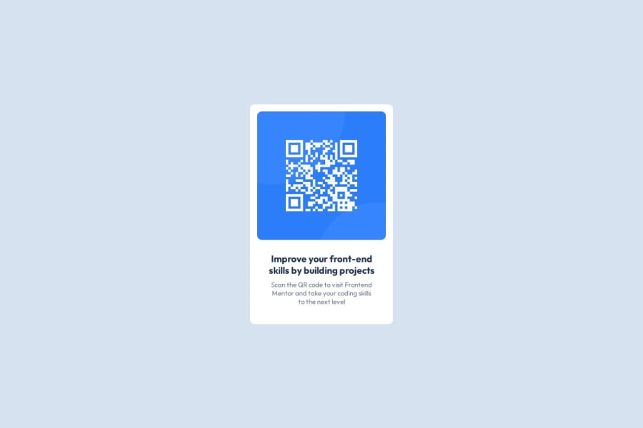
Design comparison
SolutionDesign
Community feedback
- @hitmorecodePosted 5 months ago
🎉🎊 well done, looks good. Just one thing
html{
    display: flex;
    height: 100%;
    justify-content: center;
    align-items: center;
}

// the commented out lines can be removed, you already have those inside the html
body{
    /* display: flex; */
    /* justify-content: center; */
    /* align-items: center; */
    font-family: "Outfit";
    text-align: center;
    background-color: hsl(212, 45%, 89%);
}
Keep it up 👍👌
Marked as helpful0@MARYAMTEEPosted 5 months ago@hitmorecode I really appreciate you taking the time to spot the repetition. Thanks for lending your sharp eyes
0 - @LucasedcmPosted 5 months ago
Pay attention to the roundness of borders and also the shadowing around the main container. Also, take a look at the fonts on the design system. Overall, you did a great job!
Marked as helpful0
Please log in to post a comment
Log in with GitHubJoin our Discord community
Join thousands of Frontend Mentor community members taking the challenges, sharing resources, helping each other, and chatting about all things front-end!
Join our Discord
