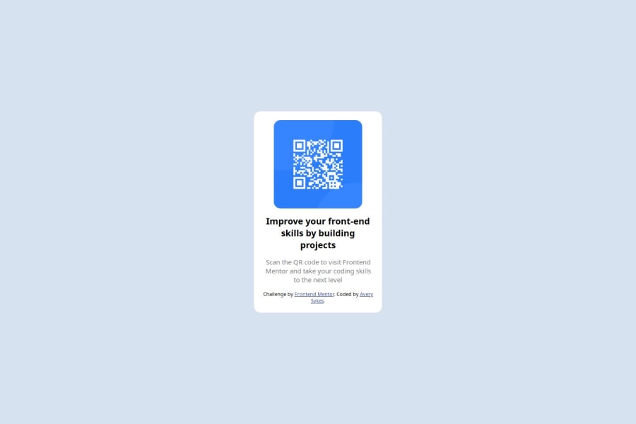
Design comparison
Solution retrospective
I got it looking very similar the design with a lot more ease than I thought.
What challenges did you encounter, and how did you overcome them?I did get some challenges with flexbox and getting it to work as desired. But once I figured out the dynamics it was very useful.
What specific areas of your project would you like help with?Importing google fonts
Community feedback
- @Mageshwari-BalaguruPosted 8 months ago
Hi, congratulations on completing the challenge! Importing google fonts - we can import google fonts in two ways. we can add link to our HTML head tag or import at CSS file.(Recommended one is adding to HTML head ) add these lines to your HTML head
<link rel="preconnect" href="https://fonts.gstatic.com" crossorigin>
<link href="https://fonts.googleapis.com/css2?family=Outfit:wght@100..900&display=swap" rel="stylesheet">```

Steps:
1. Google - type google fonts search
2. to the first search list - type your desired font name and search
3. Click get font
4. Click get embed code
5. you can see two links over the right side. (copy and paste as your wish)

I've some suggestions to your code.
1. include HTML semantics (header,main,footer)
2.you don't need to mention all the child elements to display:flex; its already in a flex-container.

Thanks.

happy coding! :)
0
Please log in to post a comment
Log in with GitHubJoin our Discord community
Join thousands of Frontend Mentor community members taking the challenges, sharing resources, helping each other, and chatting about all things front-end!
Join our Discord
