Design comparison
Solution retrospective
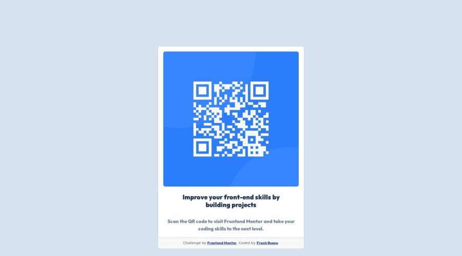
I am new to front end development and would really appreciate some advice on how to make this look nicer overall. I was trying to center the card in the page and could not figure out how to do so. Also, my card ends up not looking so great as the page gets really big or really small. Lastly, I was not sure what the directions meant by the phone and desktop widths so any help with that would be greatly appreciated. Thank you in advance!
Community feedback
- @hitmorecodePosted over 1 year ago
Congratulations well done. Just a few thing for you to fix your page. I think is best for you to restructure your markup first. To make things easier for yourself eliminate all the unnecessary div's and with that you have too many classes. You can do this challenge with two to three div's.
- You are using h5 for the card title, change that to h1
- You gave the body an id of body, you don't have to do this. There's only one body on a page so the body doesn't need an id or class.
- Vertical align is not working because you need to add a height to the body.
body {
min-height: 100vh;
background-color: hsl(212, 45%, 89%);
display: flex;
padding: 5%; ### try to avoid this when necessary. if not using correctly, this will break your page. Use fixed padding instead.
justify-content: center;
align-items: center;
text-align: center;
font-family: Outfit, sans-serif; ### it's best practice to add the font-family in the body, this will apply to the entire page. If there's need for a different font-family elsewhere only add it there where's necessary.
}
Right if you go from desk to mobile, your card gets smaller and the other way around it gets wider. To fix this add a fixed width and height to the card. You can use these values;
- Card width = 320px, height = 500px
- For the image you can either use an img tag or a div and add the image as a background with CSS. For the image window you can use width = 288, height = 288px.
Another thing that you can do, is to add a small CSS reset. This will remove all padding's and margin's from the page.
### it's best to add this at the top of your CSS
* {
margin: 0;
padding: 0;
box-sizing: border-box;
}
``
I hope this will help you to fix your page. If something is not clear or you have more questions, feel free to ask
Marked as helpful0@fbuonojrPosted over 1 year ago@hitmorecode thank you so much for the reply and helpful tips!
0 - @timbosToursPosted over 1 year ago
You can try adding min-height: 100vh; to the body
0 - @timbosToursPosted over 1 year ago
Hello friend,
To centre the card you can use
body { display: flex; justify-content: center; align-items: center; text-align: center; }To control the size of the card you can use combinations of min-height or max-height, min-width or max-width.
And to make it look a little nicer you can curve the edges with border-radius and add a box-shadow for some visual depth. You can also the move the attribution section to the bottom of the page with something like;
.attribution { position: fixed; bottom: 0; display: none; }Hope that helps :)
0@fbuonojrPosted over 1 year ago@timbosTours Thank you for the reply. The tips to to round the edges and add a shadow definitely made it look much nicer! I am still struggling with the vertical centering but I will keep playing around with it.
0
Please log in to post a comment
Log in with GitHubJoin our Discord community
Join thousands of Frontend Mentor community members taking the challenges, sharing resources, helping each other, and chatting about all things front-end!
Join our Discord
