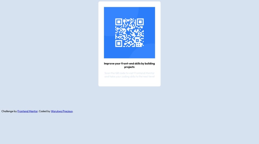
Design comparison
SolutionDesign
Solution retrospective
** Questions -How do I easily re-commit to Github? -Any tips to understand responsiveness?
Community feedback
- @IryDevPosted over 1 year ago
Hi @Preciousglows 😄. Congratulation on successfully completing this challenge ! !
I have some recommendations in order to improve your solution :
- Wrap the whole main content of your page into the semantic <main> tag. -Replace the <div class="attribution> by the semantic <footer> tag
- Semantic html improve accessibility of your web page
- Your page should have a <h1> tag
- Replace the <p> tag by the <h1>
- Add to the <main> the property, display: flex;, justify-content: center;, align-items: center; to make the card center on the vertical axis and horizontal axis
- The padding of your card seem too big reduce it to 1em
- To make the corner of the card rounded use the property border radius
HTML :
<body>
<main>
<div class="container">
<div class="pardiv">
<h1>Improve your skills by building projects</h1>
</div>
</div>
</main>

<footer class="attribution">
</footer>
</body>
CSS :
main {
height: 100vh;
display: flex;
align-items: center;
justify-content: center;
}
I hope you'll find this helpful! 😄
Marked as helpful0
Please log in to post a comment
Log in with GitHubJoin our Discord community
Join thousands of Frontend Mentor community members taking the challenges, sharing resources, helping each other, and chatting about all things front-end!
Join our Discord
