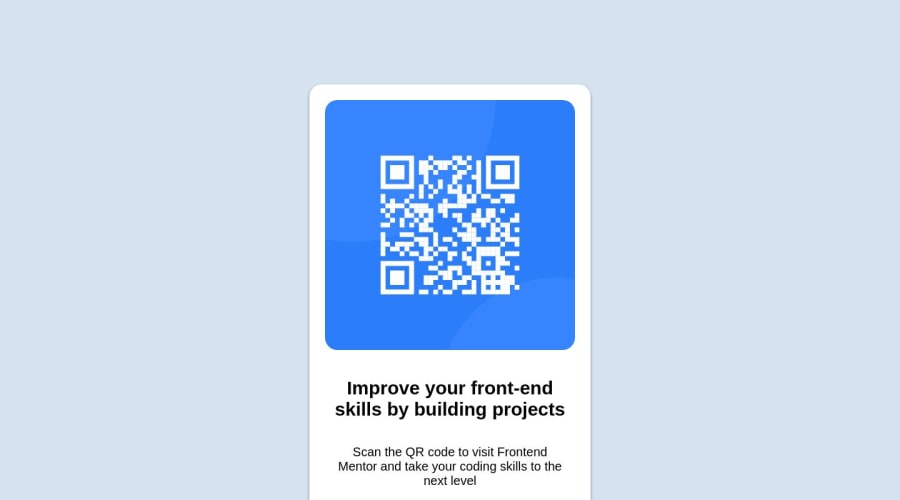
Design comparison
Solution retrospective
One of my main difficulties was using the media queries and making the proper adjustments based on the width of the screens being viewed in.
I think the only area of the code that I'm unsure of would be the media queries so if you are reviewing this, please I would like to have feedback on what I can improve on. Especially over the media queries on css.
Community feedback
- @MelvinAguilarPosted almost 2 years ago
Hello there 👋. Good job on completing the challenge !
I have some suggestions about your code that might interest you.
-
You have used many attributes to try to center it. One way to center the element is to apply grid layout to the container element.
- It is not necessary to set a minimum width or a width to the body element. This element always occupies 100% of the screen regardless of the device.
body { /* min-height: 100%; */ /* min-width: 1440px; */ /* height: 100%; */ /* width: 100%; */ }- You have used
display: grid, but thenposition: fixed. These are completely different ways of trying to center an object. Use only grid layout for this purpose.
.container {
    display: grid;
    /* justify-content: center; */
    place-content: center; /* Use this to center the card */
    text-align: center;
    font-family: "Montserrat", sans-serif;
    background-color: hsl(212, 45%, 89%);
    min-height: 100vh;
    /* min-height: 100%; */
    /* min-width: 1024px; */
    /* width: 100%; */
    /* height: auto; */
    /* position: fixed; */
    /* top: 0; */
    /* left: 0; */
}

.qr-code {
    . . .
    /* margin-top: 30%; */
    /* margin-bottom: 25%; */
}
I hope you find it useful! 😄
Happy coding!
2 -
- @ecemgoPosted almost 2 years ago
Some recommendations regarding your code that could be of interest to you.
- You can add
bodyto the CSS. Additionally, if you want to make the card centered both horizontally and vertically, you'd better add flexbox andmin-height: 100vhto the body
body { display: flex; flex-direction: column; justify-content: center; align-items: center; min-height: 100vh; background-color: hsl(212, 45%, 89%); }- When you use flexbox in the body, you don't need to use flexbox and
marginin the.qr-codeto center the card - If you use
max-width, the card will be responsive and you can reduce the width a bit - You'd better update padding to give a gap between the content and the border of the card
- You add
text-align: centerhere to center the texts
.qr-code { /* width: 450px; */ /* height: 700px; */ /* margin-top: 30%; */ /* margin-bottom: 25%; */ max-width: 300px; padding: 15px; text-align: center; }- In addition to that above, in order to make the card responsive and the image positioned completely on the card, you'd better add
width: 100%to the img
img { border-radius: 20px; /* height: 400px; */ /* width: 400px; */ /* margin-top: 25px; */ width: 100%; }- You'd better update
font-sizeof texts
.bold-text { font-weight: 700; /* font-size: 30px; */ font-size: 20px; } .min-text { font-weight: 300; /* font-size: 20px; */ font-size: 16px; }- You don't need to use
.containerandpand you can remove them
/* .container { display: grid; justify-content: center; text-align: center; font-family: "Montserrat", sans-serif; background-color: hsl(212, 45%, 89%); min-height: 100%; min-width: 1024px; width: 100%; height: auto; position: fixed; top: 0; left: 0; } */ /* p { text-align: center; margin: 40px; } */- Finally, you can remove media queries because the solution will be responsive if you follow the steps above
Hope I am helpful. :)
0 - You can add
- @0xabdulkhaliqPosted almost 2 years ago
Hello there 👋. Congratulations on successfully completing the challenge! 🎉
- I have other recommendations regarding your code that I believe will be of great interest to you.
HTML 🏷️:
- This solution may cause accessibility errors due to lack of semantic markup, which causes lacking of landmark for a webpage and allows accessibility issues to screen readers, due to accessibility errors our website may not reach its intended audience, face legal consequences, and have poor search engine rankings, highlighting the importance of ensuring accessibility and avoiding errors.
- What is meant by landmark ?, They used to define major sections of your page instead of relying on generic elements like
<div>or<span>. They are use to provide a more precise detail of the structure of our webpage to the browser or screen readers
- For example:
- The
<main>element should include all content directly related to the page's main idea, so there should only be one per page - The
<footer>typically contains information about the author of the section, copyright data or links to related documents.
- The
- So resolve the issue by replacing the
<div class="container">element with the proper semantic element<main>in yourindex.htmlfile to improve accessibility and organization of your page
.
I hope you find this helpful 😄 Above all, the solution you submitted is great !
Happy coding!
0
Please log in to post a comment
Log in with GitHubJoin our Discord community
Join thousands of Frontend Mentor community members taking the challenges, sharing resources, helping each other, and chatting about all things front-end!
Join our Discord
