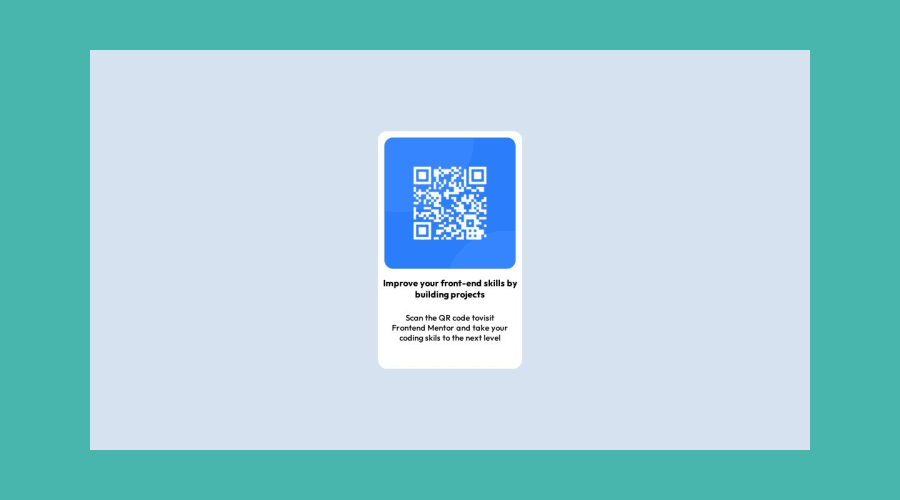
Design comparison
SolutionDesign
Solution retrospective
if I have a nested div then how can I fix both the outer div and inner div .because when I zoom out on web browser then my inner div is go out side of my outer div. how to fix it.
Community feedback
- @ecemgoPosted almost 2 years ago
Some recommendations regarding your code that could be of interest to you.
- If you want to make the card centered both horizontally and vertically, you'd better add flexbox and
min-height: 100vhto the body
body { display: flex; flex-direction: column; justify-content: center; align-items: center; min-height: 100vh; background-color: hsl(212, 45%, 89%); }- When you use flexbox in the body, you don't need to use flexbox in the
.innerto center the card - If you use
max-width, the card will be responsive and you can increase the width a bit - You'd better add
paddingto give a gap between the content and the border of the card
.inner { /* height: 380px; */ /* width: 230px; */ max-width: 300px; background-color: hsl(0, 0%, 100%); border-radius: 14px; /* display: inline; */ /* align-items: center; */ /* justify-content: center; */ padding: 15px; }- In addition to that above, in order to make the card responsive and the image positioned completely on the card, you'd better add
width: 100%to the img
.inner img { /* width: 210px; */ width: 100%; border-radius: 14px; /* margin: 10px 10px 10px; */ }- You'd better update
font-sizeof texts
.inner h1 {
  /* font-size: 0.9rem; */
  font-size: 1.4rem;
  text-align: center;
  padding: 10px 0;
}
.inner p { font-size: small; text-align: center; padding: 10px; /* margin: 10px; */ margin-bottom: 20px; color: gray; }- You don't need to use
.heroand.outerand you can remove them
/* .hero { height: 100vh; max-width: 1440px; background-color: hsl(175, 43%, 50%); display: flex; align-items: center; justify-content: center; } */ /* .outer{ display: flex; position: relative; height: 80vh; width:90vw; background-color: hsl(212, 45%, 89%); align-items: center; justify-content: space-between; } */- Finally, you can remove media queries because the solution will be responsive if you follow the steps above
Hope I am helpful. :)
0 - If you want to make the card centered both horizontally and vertically, you'd better add flexbox and
Please log in to post a comment
Log in with GitHubJoin our Discord community
Join thousands of Frontend Mentor community members taking the challenges, sharing resources, helping each other, and chatting about all things front-end!
Join our Discord
