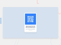
Design comparison
SolutionDesign
Solution retrospective
💡 Lessons
- Basic alignment (centering everything using Flexbox)
- Naming troubles (Tried my hand at BEM)
- Differentiated between wrappers (decorative,
background) vs containers (layout) box-shadowSubtlety is king!
Community feedback
- @ecemgoPosted over 1 year ago
Some recommendations regarding your code that could be of interest to you.
- If you use
max-width, the card will be responsive and you can reduce the width a bit
.container { /* max-width: 320px; */ max-width: 300px; }- In addition to that above, in order to make the card responsive and the image positioned completely on the card, you'd better add
max-width: 100%to the img
img { /* max-width: 80%; */ max-width: 100%; }- You'd better add
font-sizeandmarginto theh1
h1 { font-size: 1.2rem; margin: 1rem 0; }- Finally, you don't need to use media queries for this solution because the solution will be responsive if you follow the steps above.
/* @media(max-width: 355px) {
      h1 {
        font-size: 1.2em;
      }
} */
Hope I am helpful. :)
Marked as helpful1@oo2smhPosted over 1 year ago@ecemgo Thank you so much. I appreciate it! I applied your suggestions to my code 🙏
1 - If you use
Please log in to post a comment
Log in with GitHubJoin our Discord community
Join thousands of Frontend Mentor community members taking the challenges, sharing resources, helping each other, and chatting about all things front-end!
Join our Discord

