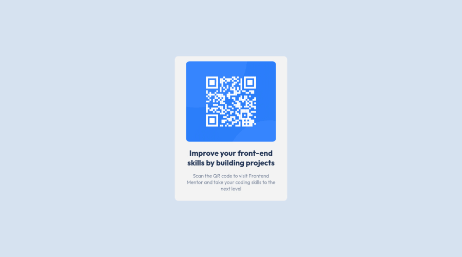
Design comparison
Solution retrospective
Any feedback is welcome!
Community feedback
- @vanzasetiaPosted almost 3 years ago
Hi, BreinerJT! 👋
Congratulations on finishing this challenge! 👏
Some recommendations from me.
- Remove
widthandheightfrom themain. Never use100vwon anything as it doesn't account for scrollbars when present. It may only ever introduce potential overflow/scroll bugs. - To make the card in the middle of the page, I would recommend making the
bodyelement as a flexbox container. It is much shorter and easier to implement then using the relative positioning with transform property.
/** * 1. Make the card vertically center and * allow the body element to grow if needed */ body { display: flex; align-items: center; justify-content: center; min-height: 100vh; /* 1 */ }- The card only needs a
max-widthto prevent it from becoming too large on wide screen sizes. So, I recommend setting amax-widthand then removing thewidthand theheightproperties. - I suggest setting all the elements
box-sizing: border-boxwith universal selector. This will prevent any elements from adding more width every time you add somepadding.
Hope this helps.
Marked as helpful0@BreinerJTPosted almost 3 years agoThanks @vanzasetia, I had never thought on this way to put the elements in the middle of the page, thank you for all your advices.
0 - Remove
- @wavegatePosted almost 3 years ago
Nice job on using semantic HTML. I would work on ensuring the obvious distortion in the width/height of the square image file, and make sure padding is consistent around all sides of the image to meet whitespace consistency, which will bring the design up a notch.
Marked as helpful0
Please log in to post a comment
Log in with GitHubJoin our Discord community
Join thousands of Frontend Mentor community members taking the challenges, sharing resources, helping each other, and chatting about all things front-end!
Join our Discord
