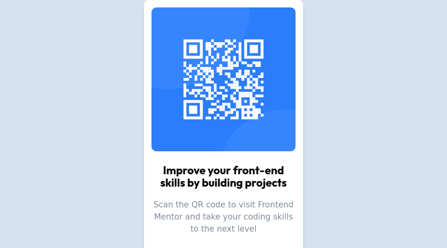
Design comparison
Solution retrospective
Adjusting the max-width property was the only challenge i faced
Community feedback
- Account deleted
Greetings! 👋 I want to start by congratulating you on completing the challenge and submitting your solution. Well done! 🎉
After reviewing your code, I noticed a few accessibility errors that could be improved. Allow me to provide some recommendations that may be of great interest to you.
Your current markup lacks landmarks for your webpage, which is causing accessibility errors. In order to improve the accessibility and organization of your page, consider replacing the <div> element with the semantic <main> element. This will help define major sections of your page and convey its structure more clearly. By including the <main> element, all content directly related to the page's main idea should be contained within it.
Another accessibility error identified in your code is the lack of a level-one heading (<h1>). Every site should have at least one h1 element that identifies and describes the main content of the page. By adding a level-one heading, users of assistive technologies can easily navigate to the main content of the page. Consider using the sr-only class to hide the heading from visual users, which will be useful for those who are visually impaired.
Your submitted solution is great, and I appreciate your effort in completing the challenge. Keep up the good work and happy coding!
Marked as helpful0 - @0xabdulkhaliqPosted over 1 year ago
Hello there 👋. Congratulations on successfully completing the challenge! 🎉
- I have other recommendations regarding your code that I believe will be of great interest to you.
HTML 🏷️:
- This solution generates accessibility error reports, "All page content should be contained by landmarks" is due to
non-semanticmarkup, which lack landmark for a webpage
- So fix it by replacing the wrapper
<div>element with the semantic element<main>in yourindex.htmlfile to improve accessibility and organization of your page.
- What is meant by landmark ?, They used to define major sections of your page instead of relying on generic elements like
<div>or<span>
- They convey the structure of your page. For example, the
<main>element should include all content directly related to the page's main idea, so there should only be one per page
HEADINGS ⚠️:
- And, this solution has also generated accessibility error report due to lack of level-one heading
<h1>
- Every site must want at least one
h1element identifying and describing the main content of the page.
- An
h1heading provides an important navigation point for users of assistive technologies, allowing them to easily find the main content of the page.
- So we want to add a level-one heading to improve accessibility by reading aloud the heading by screen readers, you can achieve this by adding a
sr-onlyclass to hide it from visual users (it will be useful for visually impaired users)
.
I hope you find this helpful 😄 Above all, the solution you submitted is great !
Happy coding!
Marked as helpful0 - @skyv26Posted over 1 year ago
Hi @Remmy1965,
I just saw your project and congratulations. You completed it by applying your Tailwind skills for designing it. But still, you can improve your design, as the card is bigger than the expected design and please follow the correct semantics. Please wrap your whole body content with
maintag. It will resolve your above mentioned issues.Marked as helpful0 - @vraj1091Posted over 1 year ago
please make some change color in text lower side so that text can visible properly
Marked as helpful0
Please log in to post a comment
Log in with GitHubJoin our Discord community
Join thousands of Frontend Mentor community members taking the challenges, sharing resources, helping each other, and chatting about all things front-end!
Join our Discord
