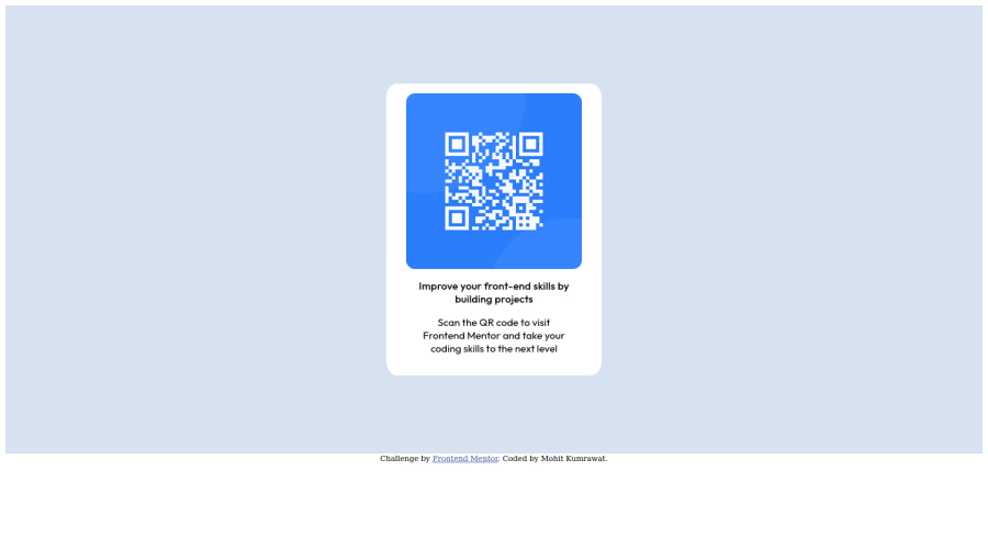
Design comparison
Solution retrospective
How could I have done it better ? How to make the site more mobile friendly ?
Community feedback
- @0xabdulkhaliqPosted over 1 year ago
Hello there 👋. Congratulations on successfully completing the challenge! 🎉
- I have other recommendations regarding your code that I believe will be of great interest to you.
CSS 🎨:
- Looks like the component has not been centered properly. So let me explain, How you can easily center the component without using
marginorpadding.
- We don't need to use
marginandpaddingto center the component both horizontally & vertically. Because usingmarginorpaddingwill not dynamical centers our component at all states
- To properly center the component in the page, you should use
FlexboxorGridlayout. You can read more about centering in CSS here 📚.
- For this demonstration we use css
Gridto center the component.
body { min-height: 100vh; display: grid; place-items: center; }- Now remove these styles, after removing you can able to see the changes
#page {
  padding-top: 8%;
  padding-bottom: 8%;
  padding-left: 25%;
  padding-right: 25%;
}

#pop {
  margin-left: auto;
  margin-right: auto;
}
- Now your component has been properly centered using best practices
.
I hope you find this helpful 😄 Above all, the solution you submitted is great !
Happy coding!
Marked as helpful1 - @ecemgoPosted over 1 year ago
Some recommendations regarding your code that could be of interest to you.
- In order to center the card correctly, you'd better add flexbox and
min-height: 100vhto thebody - For the color of the screen, you can use the recommended color in the
body
body { display: flex; flex-direction: column; justify-content: center; align-items: center; min-height: 100vh; background-color: hsl(212, 45%, 89%); }- If you use flexbox in the
body, you don't need to usemarginin the#popto center the card - Also, you don't need to use media queries for this solution. If you use
max-widthinstead ofwidth, the card will be responsive, I mean, it will be mobile-friendly.
#pop { background-color: white; /* margin-left: auto; */ /* margin-right: auto; */ /* width: 40%; */ max-width: 280px; border-radius: 5%; /* padding: 2%; */ padding: 20px 10px; }- You don't need
#pageso you can remove it.
/*
#page {
    background-color: hsl(212, 45%, 89%);
    padding-top: 8%;
    padding-bottom: 8%;
    padding-left: 25%;
    padding-right: 25%;
}
*/
Hope I am helpful. :)
Marked as helpful1@MohitKumrawatPosted over 1 year ago@ecemgo Thank you for putting in the effort to help me. This was really helpful.
1@ecemgoPosted over 1 year ago@MohitKumrawat I'm getting happy when my feedback works :)
0 - In order to center the card correctly, you'd better add flexbox and
- @LordY1susPosted over 1 year ago
The first I can recommend you is go to folder "design" and look the height and width of the mobile and desktop version. That's gonna give an idea of what size you are looking for. The second is put your img on a picture tag, I think its better, and make the picture tag flex for the qr-img can give all the size of the picture tag. The rest is just details... I think that help you.
Marked as helpful1
Please log in to post a comment
Log in with GitHubJoin our Discord community
Join thousands of Frontend Mentor community members taking the challenges, sharing resources, helping each other, and chatting about all things front-end!
Join our Discord
