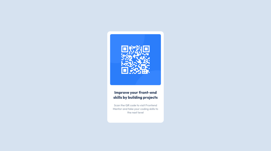
Design comparison
Solution retrospective
I just started learning HTML, CSS recently. If there is a more reliable way to do this with flexbox, please tell me, I'll be very grateful.
Community feedback
- @wavegatePosted almost 3 years ago
Great job. I like that your subtext is less strong than mine. My main suggestion is to look at accessibility for your HTML. Right now you just use <div> and <p> to split everything up. Instead, you should try to use more semantic HTML (tags with meaning) to improve accessibility and allow programs to read your site more easily.
I also chose not to use Flexbox because the margins all seemed to be inconsistent, so I think just using margins is fine.
Marked as helpful1@normie614Posted almost 3 years ago@wavegate I updated the code. Can you tell me if that is a correct use of semantic tags for a card? Thanks for all your help!
I decided to use flexbox because that is what I'm more comfortable with, hopefully soon enough I'll be able to identify and use a better alternative depending on the type of project.
0@wavegatePosted almost 3 years ago@normie614 Yes, nice job. I actually don't think semantics matters too much for a component like this (so I take my previous comment back), but I've realized it's more important for actual page layouts. I thought I knew some semantic elements but now that I'm getting to actual page layouts they make more sense to me: https://www.w3schools.com/html/html5_semantic_elements.asp. Best of luck to you.
Marked as helpful1
Please log in to post a comment
Log in with GitHubJoin our Discord community
Join thousands of Frontend Mentor community members taking the challenges, sharing resources, helping each other, and chatting about all things front-end!
Join our Discord
