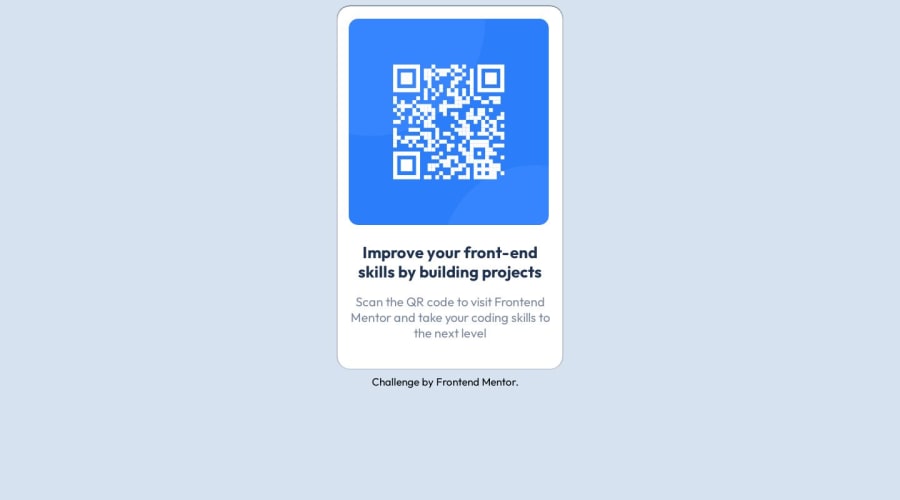
Design comparison
SolutionDesign
Community feedback
- @hitmorecodePosted over 1 year ago
congratulations well done. Just a few thing you can fix
body {
    background-color: hsl(212, 45%, 89%);
/* add a min height of 100vh to the body, to make use of the entire height of the body */
    min-height: 100vh;
    /* use flexbox to place the card in the middle of the page */
    display: flex;
    flex-direction: column;
    justify-content: center;
    align-items: center;
}

main.component {
/* I commented out things that you don't need */
/*     margin: auto; */ /* flexbox on the body will to this */
/*     margin-top: 10px; */
/*     vertical-align: middle; */
    height: 580px;
/*     min-width: 300px; */
    max-width: 360px;
    background-color: hsl(0, 0%, 100%);
    border-radius: 20px;
    box-shadow: black 0px -0.5px 2px;
}
0
Please log in to post a comment
Log in with GitHubJoin our Discord community
Join thousands of Frontend Mentor community members taking the challenges, sharing resources, helping each other, and chatting about all things front-end!
Join our Discord
