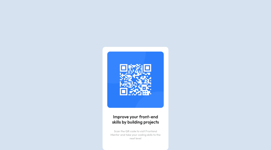
Design comparison
Solution retrospective
Do you have any suggestions for me to improve?
Community feedback
- @fayax555Posted almost 3 years ago
To center the card both horizontally and vertically, remove
margin: 0 auto; width: 1440px;and then putdisplay: grid; height: 100vh; place-content: center;to your body. If you give your bodywidth:1440px;, it can give you a horizontal scrollbar when the screen is below 1440px. Usemax-widthwhen you have to give a width to containers. But in this project, you don't have to give any widths to your body, simply do the things I've said at the beginning.Marked as helpful0@DevDoc7Posted almost 3 years ago@fayax555 Thank you for your feedback. I had already difficulties with centering the card in the first place. That's why your feedback is very helpful. Do you have any suggestions for the content of the box?
1@fayax555Posted almost 3 years ago@DevDoc7 You don't need
position: relativeon any of the element is this project.If your project uses only one
font-family, put it on the body instead of individual elements, it gets inherited to its children.You don't need
widthon any elements in this projecct. Givemax-width: 100%to your image to fit it in its container. No need to give the image width or height.I have also completed this challenge. Have a look at it.
frontend mentor - https://www.frontendmentor.io/solutions/qr-code-component-PeNjQKXsa
github repo - https://github.com/fayax555/qr-code-component/blob/main/index.html
0
Please log in to post a comment
Log in with GitHubJoin our Discord community
Join thousands of Frontend Mentor community members taking the challenges, sharing resources, helping each other, and chatting about all things front-end!
Join our Discord
