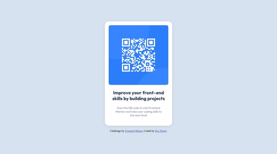
Design comparison
SolutionDesign
Solution retrospective
Hello! this is my submission for the QR Code Component challenge!
I'm open for any kind of feedback. Thank you.
Community feedback
- @hitmorecodePosted over 1 year ago
Congratulations well done.
body{
background-color: hsl(212, 45%, 89%);
display: flex;
flex-direction: column;
align-items: center;
/* add these two lines to place the card in the middle of the page*/
min-height: 100vh;
justify-content: center;
}

.container{
background-color: hsl(0, 0%, 100%);
border-radius: 20px;
display: flex;
flex-direction: column;
justify-content: center;
/*     margin-top: 100px; */ /* remove this line. the two lines added on the body will do the same thing and that is better for responsiveness */
margin-bottom: 20px;
padding: 20px;
width: 350px;
height: 520px;
box-shadow: 0 2px 15px rgba(0,0,0,.1);
}
Marked as helpful0
Please log in to post a comment
Log in with GitHubJoin our Discord community
Join thousands of Frontend Mentor community members taking the challenges, sharing resources, helping each other, and chatting about all things front-end!
Join our Discord
