

Design comparison

Solution retrospective
I am proud of how I managed to get the dimensions down because I don't have a sharp eye just yet.
What challenges did you encounter, and how did you overcome them?I didn't encounter any particular challenge.
What specific areas of your project would you like help with?I'd like to know if there's any better way I could have written my HTML document, but help with anything overall is greatly, greatly appreciated.
Community feedback
- @indaqooPosted 9 months ago
Hey,
First of all, I wanted to welcome you to Frontend Mentor and congratulate you on successfully completing your first challenge.
Let's start by reviewing your HTML. The general structure looks good.
Maybe I'm nitpicking here, but I think it would be great if you used the <div> element for the card itself and wrapped both text elements in their own <div> element, like in the example below:
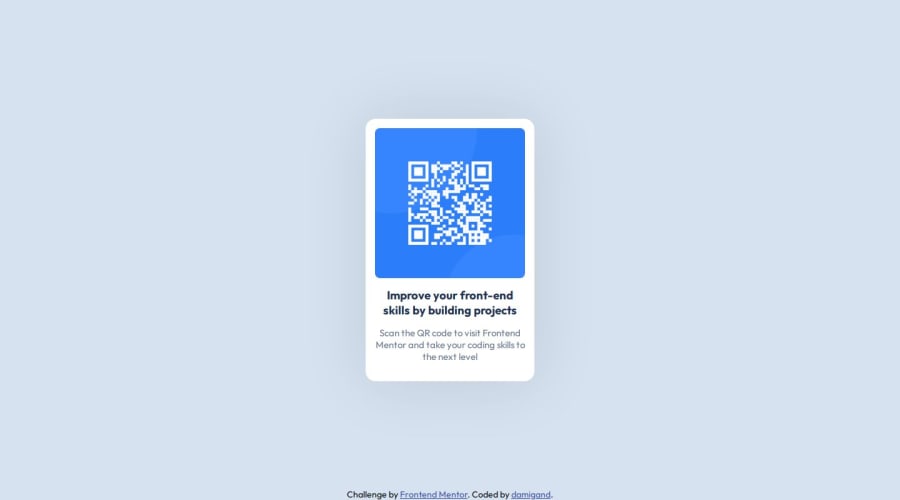
<main>
   <div class="card">
      <img src="./assets/images/image-qr-code.png" alt="qr code" loading="lazy" />
      <div class="card-content">
        <h1>Improve your front-end skills by building projects</h1>
        <p>Scan the QR code to visit Frontend Mentor and take your coding skills to the next level</p>
      </div>
   </div>
</main>
Here is a good resource of example card - w3school example card
Looking at the css..
I see that you missed the left and right padding in the text section, which is included in the Figma design file's "Text" component - view screenshot
The
border-radiuson the card should be20pxinstead of16px- view screenshotThe padding on the card should be
16pxinstead of15px.The card's image is currently
240pxby240pxbut in the design it is288pxby288pxThere are a lot of incorrect/missing values that are specific to this task and provided to us.
I think you need to pay more attention to the design system provided in the Figma files and maybe watch a Figma tutorial to see where to get all the values. This will ensure that all the challenges look as good as possible.
Overall, it is a good project, but I would recommend following the provided design system more closely to improve accuracy and consistency.
Marked as helpful2@damigandPosted 9 months ago@RobertsPeirags this is pretty good feedback and I appreciate the honestly through the entire post. Personally I didn't want to look at the figma design because, generally speaking, I'm not going to have access to them in future challenges, so I wanted to use this first submission as a test to see if I could eye-catch the dimensions. That being said, obviously the resource was there, so it was dumb of me not to check it.
Cheers and have a great one!
0 - @shinzenkoPosted 9 months ago
Hey great work buddy looks precisely like it the only small issue. i think is that the container for qr code and image itself was a little smaller than the figma dimentions but apart from that well done.
Also if u observer the heading under image and the text under heading align together at the ends but your text seems to take more width than heading. I dont think there are any major flaws just small ones keep it rolling.
Marked as helpful1@damigandPosted 9 months ago@shinzenko Both the header and the text have the same width, I think it's just
text-align: centerdoing weird things, thank you though!0


Please log in to post a comment
Log in with GitHubJoin our Discord community
Join thousands of Frontend Mentor community members taking the challenges, sharing resources, helping each other, and chatting about all things front-end!
Join our Discord