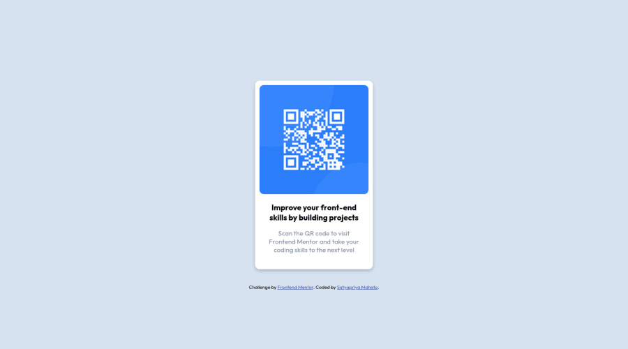
Design comparison
SolutionDesign
Solution retrospective
This was my first project on frontendmentor.io so I have tried to make the project similar to the design given. I am a beginner so please suggest any changes I have to make.
Community feedback
- @ecemgoPosted over 1 year ago
Some recommendations regarding your code that could be of interest to you.
HTML
In order to fix the accessibility issues:
- You need to replace
<div class="wrapper">with the<main class="wrapper">tag and<div class="attribution">with the<footer class="attribution">tag. You'd better use Semantic HTML, and you can also reach more information about it from Using Semantic HTML Tags Correctly. - Each main content needs to start with an h1 element. Your accessibility report states page should contain a level-one heading. So, you should use one
<h1>element in the<main>tag. You can replace your<h3><b>Improve your front-end skills by building projects</b></h3>element with the<h1><b>Improve your front-end skills by building projects</b></h1>element.
After committing the changes on GitHub and you need to deploy it as a live site. Finally, you should click generate a new report on this solution page to clear the warnings.
CSS
- In order to center the card correctly, you'd better add flexbox and
min-height: 100vhto thebody - For the color of the screen, you can use the recommended color in the
body
body {
  display: flex;
  flex-direction: column;
  justify-content: center;
  align-items: center;
  min-height: 100vh;
  background-color: hsl(212, 45%, 89%);
}
Hope I am helpful. :)
0 - You need to replace
Please log in to post a comment
Log in with GitHubJoin our Discord community
Join thousands of Frontend Mentor community members taking the challenges, sharing resources, helping each other, and chatting about all things front-end!
Join our Discord
