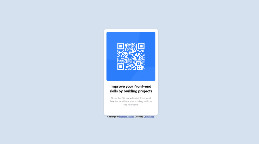
Design comparison
SolutionDesign
Solution retrospective
Playing around with viewport values
Community feedback
- @ecemgoPosted over 1 year ago
Some recommendations regarding your code that could be of interest to you.
If you want that this solution is responsive, I suggest some techniques without using media query for this solution. Also, I recommend avoiding repetition in your code and not using styles that don't work.
- If you want to make the card centered both horizontally and vertically, you'd better add flexbox and
min-height: 100vhto thebody
body { background-color: #d6e1f0; display: flex; flex-direction: column; justify-content: center; align-items: center; min-height: 100vh; }- When you use flexbox in the
body, you don't need to use flexbox in the.secondaryContainerto center the card - If you use
height, it prevents that the card will be responsive
.secondaryContainer { /* display: flex; */ /* flex-direction: column; */ /* height: 28rem; */ }- In addition to that above, in order to make the card responsive and the image positioned completely on the card, you'd better add
width: 100%to the img - You'd better update
border-radiusin this way:
img { /* border-radius: 0.5rem 0.5rem 0.5rem 0.5rem; */ border-radius: 0.5rem; width: 100%; }- Finally, if you follow the steps above, the solution will be responsive.
- You don't need to use media query and you can remove it
/* @media only screen and (max-width: 600px) {
  #mainContainer {
    height: 70vh;
  }
} */
Hope I am helpful. :)
Marked as helpful0 - If you want to make the card centered both horizontally and vertically, you'd better add flexbox and
Please log in to post a comment
Log in with GitHubJoin our Discord community
Join thousands of Frontend Mentor community members taking the challenges, sharing resources, helping each other, and chatting about all things front-end!
Join our Discord
